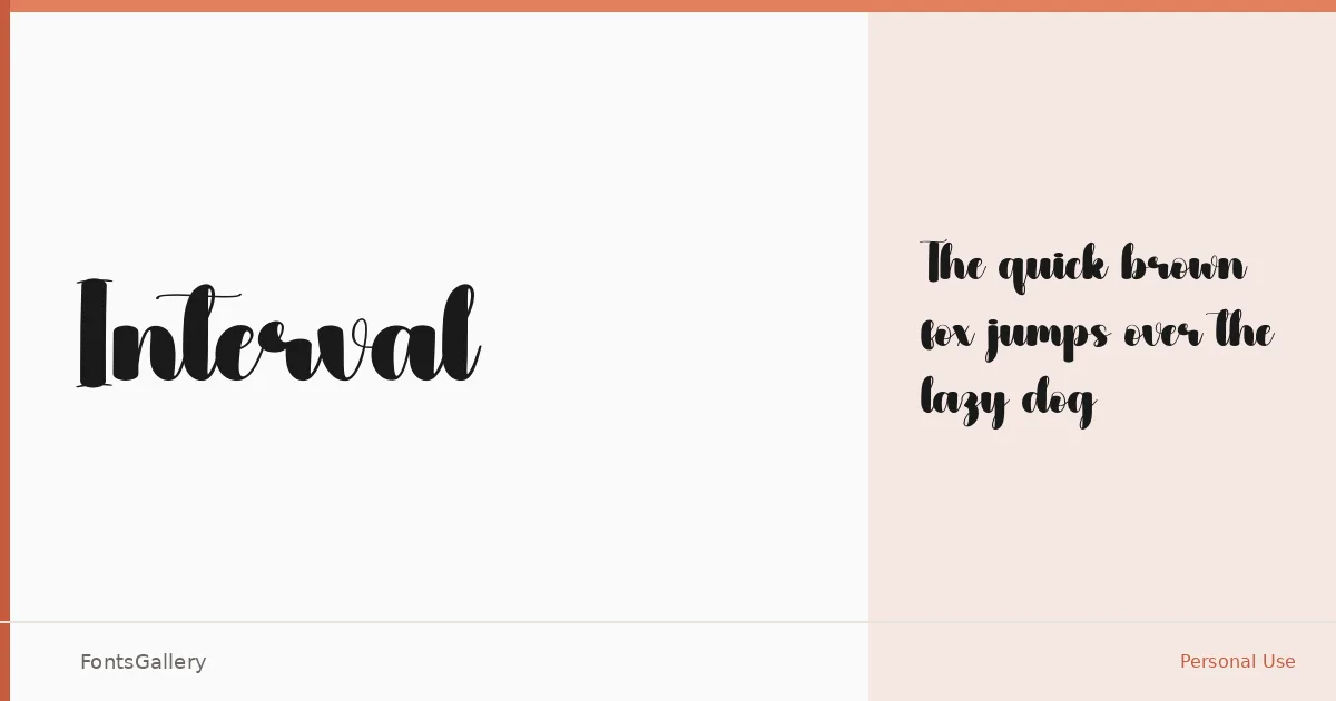
About Interval Font
There is a measured grace to this script — the kind of unhurried rhythm you find in calligraphy done with real intention, where each stroke connects to the next without rushing. It arrives as a single cut, Regular, delivered as an OTF file, and that restraint suits it. One well-drawn weight, built for Latin text, is enough when the letterforms carry this much character.
Design Aesthetics & Character Characteristics
The mood sits squarely in classic, elegant, and romantic territory — the sort of script that reads as handwritten without pretending to be casual. Curves are confident rather than fussy, and the overall feel is closer to formal penmanship than to brush lettering. In practice that means it holds its composure at display sizes without collapsing into decoration.
Recommended Usage & Font Pairing
Wedding invitations and greeting cards are the natural home here, though the refinement of the letterforms also translates well to logo marks and social media graphics where a single elegant word needs to carry the moment. For pairing, the family works alongside Canela, Helvetica, ABC Arizona, Asap, and Adobe Caslon Pro — each offering a different kind of contrast, from editorial warmth to clean neutrality.
License & Usage Terms
Interval is available under Personal Use terms, which means commercial use is not covered — confirm licensing with the rights holder before deploying it in any paid or client-facing work. The file is cleared for installable embedding.