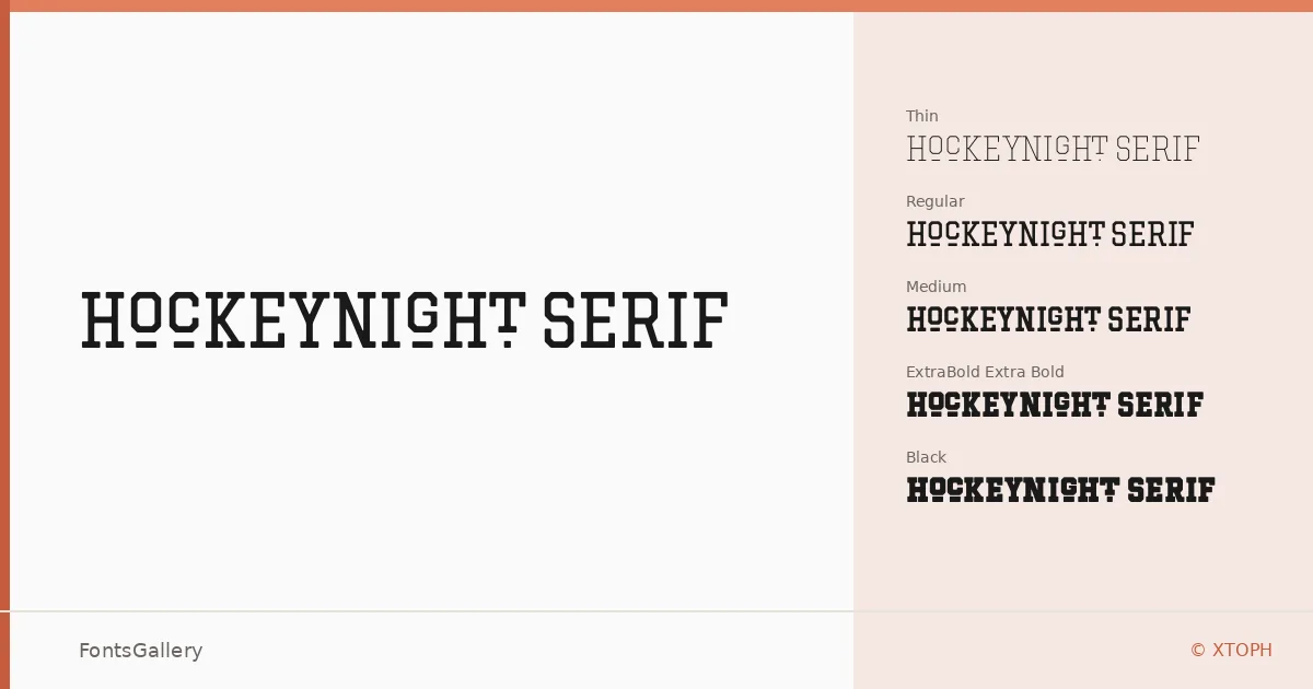
About Hockeynight Serif Font
There is a particular confidence in a well-drawn slab serif — the way the heavy bracketed terminals hold the line, the way the weight feels earned rather than applied. This family, designed by XTOPH, leans into that confidence across fourteen styles, from Thin and Thin Italic all the way through to Black and Black Italic, with Light, Regular, Medium, Bold, and Extra Bold rounds in between, each paired with a matching italic.
Design Aesthetics & Character Characteristics
The mood sits somewhere between vintage broadside and modern brand mark: classic in structure, bold in intention, and distinctly professional in execution. The slab construction gives every weight a grounded, authoritative presence — at lighter settings the italics carry a restrained elegance, while the Black and Extra Bold cuts have the kind of density that dominates a composition without crowding it. All styles are delivered in OTF format.
Recommended Usage & Font Pairing
The range of weights makes it well suited to headline hierarchies, poster layouts, logo lockups, and branding systems where Latin-language copy needs to carry real visual weight. It also translates naturally to T-shirt and apparel graphics, where that vintage-classic character reads well at large scale. XTOPH lists Etna, Angeletta, Helvetica, Armelie, and Bahnschrift as compatible companions — a spread that covers everything from decorative script contrasts to clean sans-serif counterpoints.
License & Usage Terms
Hockeynight Serif is available under a Personal Use license, which means commercial use is not permitted — confirm licensing terms directly with XTOPH before applying it to any client or commercial work. Embedding is set to editable.