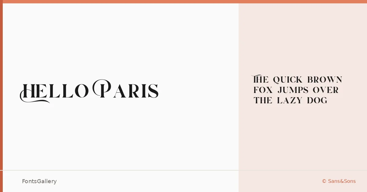
About Hello Paris Font
There is a particular tension in a serif that wants to feel both modern and romantic — too far in either direction and the whole thing collapses. Angga Suwista, working under the Sans&Sons foundry, found that balance here: the letterforms carry the weight of a classical serif but with a clean, contemporary sharpness that keeps them from feeling nostalgic. The result is a typeface with genuine presence on the page.
Design Aesthetics & Character Characteristics
This is a serif family with a mood pulled firmly toward elegance and luxury — the kind of face that reads as deliberate and considered rather than decorative. The family comes in a single style, Hello Paris Bold, delivered as a TTF in Regular Bold weight. The strokes have that confident contrast you expect from a display serif: high enough to feel refined, controlled enough to hold up in headline-sized settings. It covers the Latin script.
Recommended Usage & Font Pairing
The weight and character make it a natural fit for branding and logo work, magazine headlines, posters, and website headers — anywhere the type needs to carry authority without a lot of supporting visual noise. For body copy or secondary text, it pairs well with Helvetica for a clean sans contrast, or with Ballmain, Alexandria, Batoshi, and Audex when you want something with more personality alongside it.
License & Usage Terms
Hello Paris is available under a Personal Use license — commercial use is not permitted under these terms, so confirm licensing with Sans&Sons before taking it into a paid project. The font is installable with embedding permissions included.