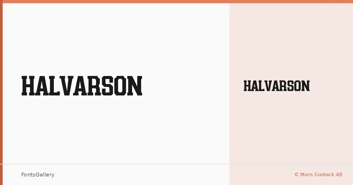
About Halvarson Font
There is a deliberate weight to the serifs here — squared, planted, unapologetic. Halvarson comes from Måns Greback of Måns Greback AB, and it arrives as a single Regular cut in OTF format. The slab construction reads with the kind of authority you associate with old trade printing and carved signage, yet the proportions stay composed rather than heavy-handed.
Design Aesthetics & Character Characteristics
This is a slab serif that sits comfortably in the bold, classic, and vintage corner of the spectrum, with a professional edge that keeps it from feeling purely nostalgic. The single Regular style is built for display work — the letterforms carry enough internal structure to hold up large, where the bracketed slabs and measured stroke contrast do their best work. Latin and Latin Extended character sets are included, along with Vietnamese coverage, so the face handles a reasonable range of Latin-based languages.
Recommended Usage & Font Pairing
The natural home for this face is anywhere the headline, poster, or signage needs real typographic presence — brand marks, logotypes, and outdoor applications where the slab structure does the heavy lifting. For contrast in layouts, the listed pairing suggestions span clean sans options like Helvetica and Bahnschrift alongside more expressive display faces such as Etna, Angeletta, and Armelie, giving you room to calibrate how much personality surrounds it.
License & Usage Terms
Halvarson is available under Personal Use terms, which means embedding is restricted and commercial use is not permitted under the default license — visit www.mansgreback.com to obtain a commercial license before deploying it in any paid or client work.