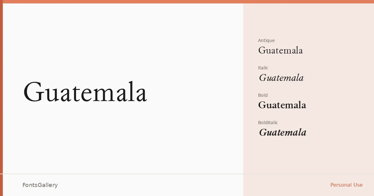
About Guatemala Font
There is something deliberately unhurried about these serifs — the kind of considered stroke contrast and bracketed terminals that recall the editorial typography of an earlier era. The family arrives in four cuts: Regular Antique, Regular Italic, Bold, and Bold Italic, giving you both upright and inclined forms at two weights. The copyright dates trace back to Brother Industries, Ltd., from the mid-1990s, and the letterforms carry that period's confidence in classical construction.
Design Aesthetics & Character Characteristics
This is a serif family that sits squarely in the classic and vintage register — elegant without being decorative, professional without feeling sterile. The "Antique" designation on the roman speaks to its old-style sensibility: warm, slightly worn in character, and comfortable at display sizes. The italic cuts complement the uprights naturally, and the bold weights add enough presence for headline work without breaking the family's overall restraint. All files are delivered in TTF format with installable embedding permissions.
Recommended Usage & Font Pairing
The family reads well wherever a vintage or heritage tone is appropriate — book covers, magazine headlines, logo lockups, and branding identities that want history behind them. Its Latin character set covers the standard range for Western European editorial and commercial work. For pairing, the clean geometry of Helvetica or Aileron makes a strong counterpoint to its antique warmth, while Ballmain, Abrade, and Batoshi offer more character-driven alternatives when the design calls for something less neutral alongside it.
License & Usage Terms
Guatemala is offered under Personal Use terms, which means commercial use is not permitted — confirm licensing arrangements with the rights holder before applying it to any client or revenue-generating work.