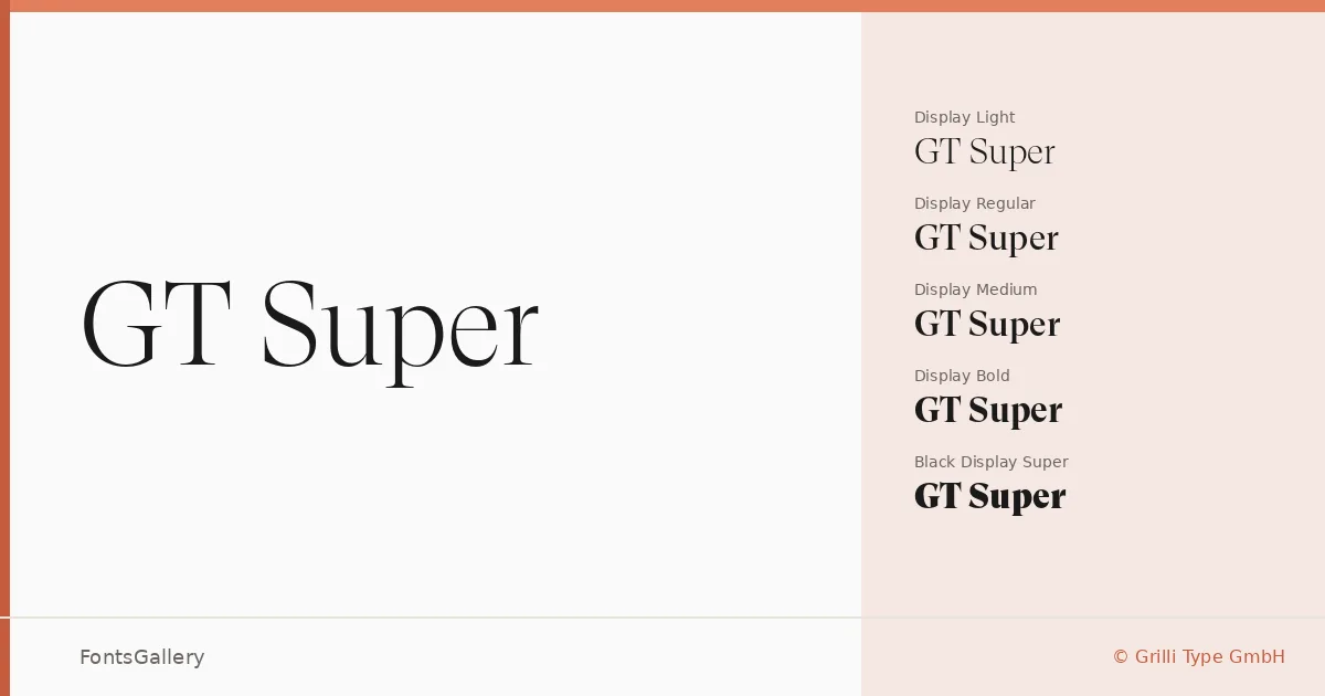
About GT Super Font
There is a particular confidence in the way this serif carries its contrast — high-waisted, bracketed, with a classical warmth that never tips into pastiche. Designed by Noel Leu for Grilli Type GmbH, it works across two distinct optical streams: a Text series built for reading comfort at smaller sizes, and a Display series that lets the forms open up and show their full elegance at headline scale.
Design Aesthetics & Character Characteristics
The family spans Book through Black across both Text and Display subfamilies, giving you a full range from restrained body-copy weights to a Super Display cut with real visual authority. Every weight ships with a matching italic, so the complete set runs from Light Book and Light Book Italic all the way to Black and Black Display Super Italic — twenty cuts in OTF format. The mood sits firmly in the classic and elegant register, but the proportions have enough contemporary sharpness to keep things from feeling merely historical. Latin character coverage is included throughout.
Recommended Usage & Font Pairing
The Text cuts earn their keep in magazine editorial and long-form book covers, while the Display weights are built for branding, website headers, and anywhere a headline needs presence without shouting. The pairing list is deliberately wide: Helvetica provides a clean neutral counterpoint, while Armelie, Etna, Kactigona, and Asap each offer different tonal options depending on whether a project calls for warmth, geometry, or a more contemporary sans alongside the serif.
License & Usage Terms
These files are offered under a Demo license, which means personal-use terms apply — confirm with Grilli Type GmbH before committing them to any commercial job. Embedding is permitted at the editable level.