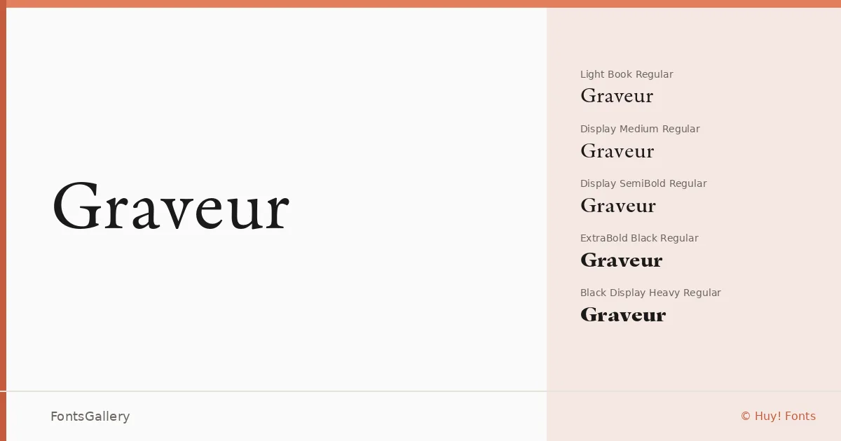
About Graveur Font
There is something deliberately unhurried about the serifs here — the kind of considered contrast between thick and thin strokes that signals a designer who studied the classical tradition before deciding which parts of it to keep. Graveur is the work of Juanjo López, released through his foundry Huy! Fonts, and it carries that editorial seriousness through every weight and optical variant in the family.
Design Aesthetics & Character Characteristics
The family spans a wide tonal range — from Light Book and Light Book Italic up through Regular, Medium, SemiBold, Bold, Black, and Heavy, with dedicated Display cuts running alongside the text grades at most weights, all in OTF format. The distinction between the text and display variants matters: the Display styles lean into elegance and luxury, with the kind of refined detailing that rewards large-scale setting, while the Book grades hold their composure at smaller sizes. Italics are available throughout. The overall mood sits at the intersection of classic structure and modern restraint — neither nostalgic nor coldly geometric.
Recommended Usage & Font Pairing
The weight range and the presence of genuine display cuts make this well suited to magazine editorial layouts, book cover design, headline hierarchies, and branding or logo work where a luxury register is called for. For pairing, the clean geometry of Helvetica or Josefin Sans provides a strong neutral counterpoint to the serif's formality, while Asap offers a friendlier sans alternative; Armelie and Kactigona bring their own expressive character to more decorative combinations.
License & Usage Terms
These files are offered under a Demo license, which does not permit commercial use — confirm licensing terms with Juanjo López at [email protected] before taking this into a client or commercial job; a separate webfont license is also required for any @font-face usage. The full terms are available at juanjez.com/licensing.