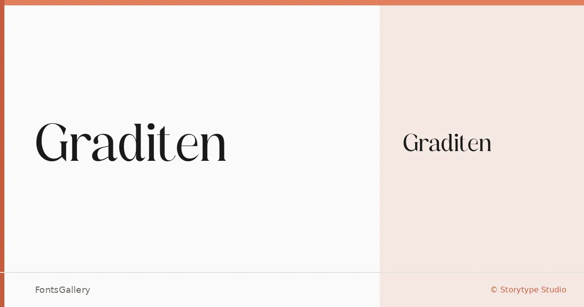
About Graditen Font
There is a quiet confidence to these serifs — the kind that reads as considered rather than decorative. Graditen comes from Heru Utama Putra at Storytype Studio, and it arrives as a single Regular cut in OTF format, built with a Latin character set and a disposition that leans firmly toward the elegant and the classic.
Design Aesthetics & Character Characteristics
The design sits in a register that feels at once modern and rooted in tradition — the sort of serif you reach for when a project needs to carry a sense of luxury without shouting about it. That single Regular weight keeps things focused: the letterforms carry their own authority, with the kind of refined stroke contrast that suits display work far more than body copy set at nine points. Think of it as a headline face that has been given something to say.
Recommended Usage & Font Pairing Suggestions
It earns its place most naturally at large sizes — book covers, magazine headers, logo wordmarks, and branding applications where a serif needs to feel polished rather than stiff. For website headers especially, the forms hold their composure on screen. When you need a companion, the clean geometry of Bahnschrift or Helvetica provides useful contrast, while Angeletta, Rasley Heights, and Etna offer warmer, more stylized alternatives depending on the tone of the project.
License & Usage Terms
This family is released under a Personal Use license — ©Storytype Studio 2021, All Rights Reserved — and commercial use is not permitted under those terms, so confirm licensing directly with the foundry before committing it to a paid job.