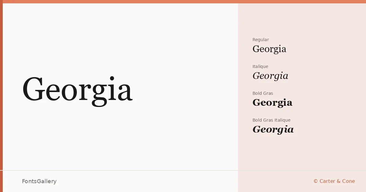
About Georgia Font
Few screen serifs have aged as gracefully as this one. Drawn by Matthew Carter for Carter & Cone, it was built from the start to hold its shape at small sizes on low-resolution displays — a discipline that gave the letterforms a clarity and openness that reads just as well in print. The generous x-height, bracketed serifs, and carefully weighted strokes reflect a designer who understood that elegance and legibility are not competing goals.
Design Aesthetics & Character Characteristics
This is a classic serif with a distinctly modern structural confidence — the kind of face that feels professional without stiffness. The family ships in TTF format across four cuts: Regular Normal, Regular Italique, Bold Gras, and Bold Gras Italique. The italic is a true drawn italic rather than a sloped roman, and the bold carries real weight without crowding, making the set genuinely useful for editorial hierarchies where contrast between heading and body text matters.
Recommended Usage & Font Pairing
The combination of classic elegance and screen-ready clarity makes it a natural choice for website headers, magazine layouts, book covers, and presentation decks. Its Latin, Cyrillic, and Greek coverage means it can carry multilingual editorial projects without switching faces mid-document. For pairing, the clean neutrality of Helvetica or Josefin Sans balances the serif warmth well; Asap brings a friendlier grotesque tone, while Armelie and Kactigona offer more expressive contrast when a headline needs to shift register entirely.
License & Usage Terms
Georgia is supplied under Personal Use terms as a Microsoft-licensed font — commercial use is not permitted, so confirm your usage against the full Microsoft typography license at microsoft.com/typography/fonts before taking it into a paid project. Embedding is permitted at the editable level, though any use beyond displaying, printing, and permitted embedding is prohibited under the license terms.