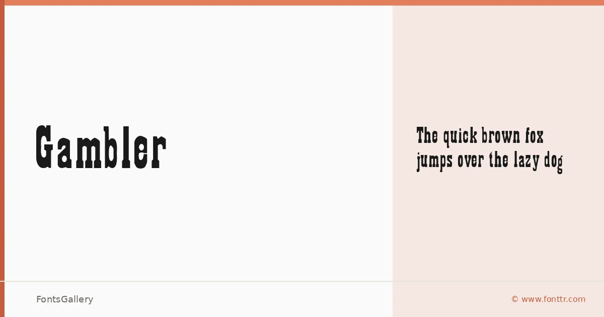
About Gambler Font
There is a deliberate heaviness to these letterforms — the kind of weight you associate with woodblock printing, saloon signage, and hand-lettered broadsides. Released by www.fonttr.com, this single-cut slab serif carries that rough, purposeful gravity through every character, with thick strokes and sturdy serifs that feel hewn rather than drawn.
Design Aesthetics & Character Characteristics
The family ships as a single Regular cut in TTF format, which keeps things focused. The mood is unambiguously bold and rustic — this is a vintage slab with a classic backbone, the sort of face that reads instantly at large sizes and leans into its own bluntness. The partial Latin coverage is worth noting: it handles the essentials cleanly, but extended character sets should be checked against your copy before committing.
Recommended Usage & Font Pairing
It earns its place in headline-driven work — posters, logos, branding treatments, and T-shirt graphics where that weathered, authoritative tone is exactly the point. For contrast, the clean geometry of Helvetica pulls the vintage weight back toward the contemporary, while Allura or Vintage Melinda introduce a cursive softness that plays well against the slab's rigidity. (AH) Manal and Abrade offer further options when the pairing needs to shift in a different direction entirely.
License & Usage Terms
This family is available under Personal Use terms, which means commercial use is not permitted — confirm licensing directly with www.fonttr.com before using it on any paid or client-facing project.