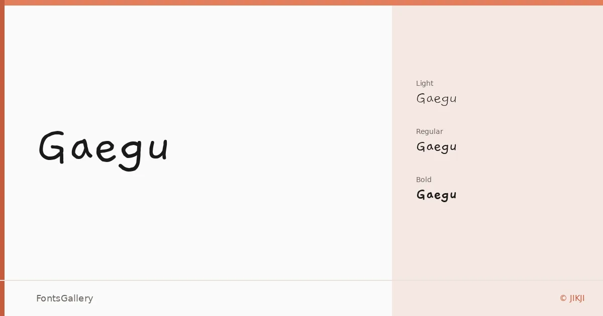
About Gaegu Font
There is a looseness to these letterforms that feels genuinely hand-drawn rather than merely hand-inspired — the strokes carry the small inconsistencies and casual momentum of a pen moving across paper without stopping to correct itself. Created by JIKJI, the family is built around Hangul, bringing a warmly imperfect quality to Korean script that formal typefaces rarely attempt.
Design Aesthetics & Character Characteristics
This is a handwritten family with a playful, whimsical character and just enough rustic roughness to keep it honest. The three weights — Light, Regular, and Bold — give it a usable range: Light reads as airy and informal, while Bold pushes into something more emphatic without losing the handmade spirit. All cuts are delivered as TTF files, which install cleanly across desktop environments.
Recommended Usage & Font Pairing
The natural homes for this family are anywhere warmth and spontaneity matter — children's book layouts, greeting card copy, social media graphics, and branding that wants to feel approachable rather than corporate. Poster work benefits especially from the Bold, where the hand-drawn quality reads well at display sizes. It pairs well with the clean geometry of Helvetica, the editorial confidence of Canela, the precision of ABC Arizona, the structured character of Etna, or the classical texture of Adobe Caslon Pro — any of which can anchor body text while this family handles the expressive moments.
License & Usage Terms
Released under the SIL Open Font License, Version 1.1, with commercial use permitted — full terms and FAQ are available at http://scripts.sil.org/OFL. Embedding is set to installable, so documents carrying these fonts can be shared and edited freely.