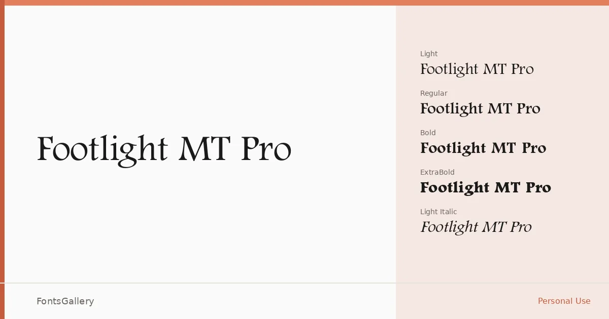
About Footlight MT Pro Font
There is something distinctly theatrical about these letterforms — a lightness of stroke, an upright posture, and a refined flare at the terminals that sits somewhere between classical roman and art-deco elegance. The family carries a copyright shared between Adobe Systems and The Monotype Corporation, and it arrives as a complete set of OpenType files covering Latin script across eight cuts: Light, Light Italic, Regular, Regular Italic, Bold, Bold Italic, ExtraBold, and ExtraBold Italic.
Design Aesthetics & Character Characteristics
This is a serif with a clear sense of occasion — the kind of face that reads as both classic and luxurious without forcing the point. The stroke contrast is moderate and the letterforms carry an inherent professionalism, making the lighter weights feel airy and editorial while the ExtraBold holds the page with genuine authority. Having both roman and italic cuts at every weight gives you real flexibility in setting hierarchies, whether you are working in a display context or building a typographic system that needs range.
Recommended Usage & Font Pairing
The elegant, headline-ready character of this family makes it a natural choice for book covers, magazine layouts, certificates, and branding work where a sense of luxury needs to come through without ostentation. For pairing, the clean geometry of Bahnschrift or Helvetica provides a useful neutral counterweight at smaller sizes, while Angeletta, Etna, and Rasley Heights each offer complementary expressive qualities for display-heavy compositions.
License & Usage Terms
This family is available under Personal Use terms — commercial use is not permitted, so confirm your licensing situation before taking it into a client or revenue-generating project. Embedding is restricted to preview and print only.