About Flatline Font
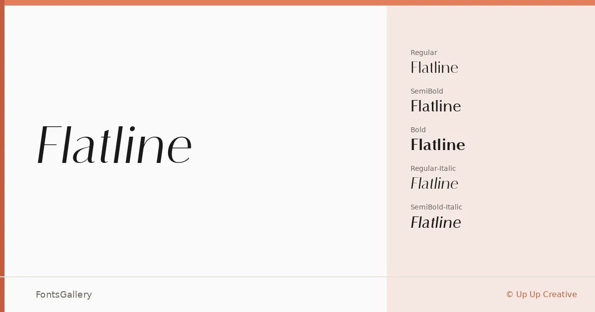
There is a controlled tension in these serifs — the kind that comes from designers who know exactly when to stop. Flatline is a serif family by Up Up Creative, built in three weights with matching italics: Regular, SemiBold, and Bold, each delivered as OTF files. The letterforms sit somewhere between editorial restraint and quiet luxury, with serifs that feel deliberate rather than decorative.
Design Aesthetics & Character Characteristics
The family reads as modern and minimal without sacrificing the warmth that makes a serif worth setting at display sizes. Across the six styles — Regular, Regular-Italic, SemiBold, SemiBold-Italic, Bold, and Bold-Italic — the weight progression is even and usable, giving you enough range to structure a hierarchy without reaching for a second family. The italic cuts carry genuine character rather than simply slanting the roman, which matters most at headline scale where every detail is visible.
Recommended Usage & Font Pairing
The design is best suited to contexts where elegance does the selling: book covers, magazine layouts, logos, and branding systems that want refinement over novelty. Latin language coverage covers the core Western European publishing and branding market. For pairing, the family works well alongside Helvetica or Bahnschrift when a clean sans is needed for body or UI copy, and alongside script or display faces like Armelie or Kactigona when contrast is the goal. Etna and Kactigona are also worth considering when the project calls for a bolder display counterpart.
License & Usage Terms
Flatline is offered under a Personal Use license, which means it is not cleared for commercial work — confirm licensing directly with Up Up Creative at upupcreative.com before using it in any client or revenue-generating project. Embedding is permitted at the editable level.