About Fazeta Demo Font
There is a considered sharpness to these serifs — the kind that signals a designer who has thought carefully about contrast, optical weight, and the relationship between thick and thin strokes. Andrej Dieneš, working under his own foundry at adtypo.com, has built a family that moves deliberately between caption, text, and display registers, each tuned for its intended size environment. The result is a serif with genuine classical backbone and an unmistakable sense of refinement.
Design Aesthetics & Character Characteristics
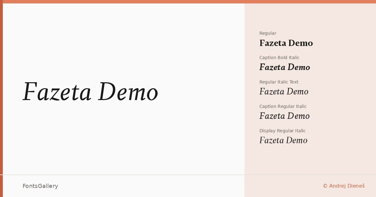
The family spans eight styles across three optical grades — Caption, Text, and Display — each offered in Regular Italic and Bold Italic, alongside a base Demo cut. Available in both OTF and TTF, the forms carry a classic, elegant character that reads as professional and, at larger sizes, genuinely luxurious. The Display cuts open up beautifully for headline work, where the high contrast between strokes has room to breathe, while the Caption and Text grades hold their composure at smaller settings without sacrificing that underlying elegance.
Recommended Usage & Font Pairing
This family is well suited to editorial work — magazine spreads, book covers, and branded headline treatments where a serif with quiet authority is needed. It also holds its own in logo and branding contexts that call for a polished, professional tone rather than novelty. For pairing, the clean geometry of Bahnschrift or Helvetica provides strong neutral contrast, while Angeletta, Magnolia Script, and Etna offer warmer or more expressive companions depending on the mood of the project.
License & Usage Terms
Fazeta Demo is released under Personal Use terms — confirm licensing with Andrej Dieneš at adtypo.com before applying it to any commercial job. The fonts are issued with editable embedding permission.