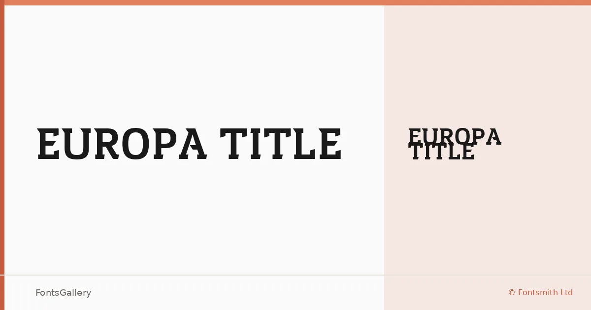
About Europa Title Font
There is a deliberate weight to these letterforms — a slab serif cut for scale, where the serifs land with authority rather than decoration. Created by F. Mello, J. Smith, P. Garnham, and B. Frank at Fontsmith Ltd, the design carries UEFA's copyright and trademark, which tells you something about its intended context: this is a face built for a major identity system, not a general-purpose release.
Design Aesthetics & Character Characteristics
The family ships as a single style — Europa Title Bold — in TTF format. That single cut is enough to communicate the mood the designers were after: bold, classic, and unapologetically modern in the way that headline slabs can be when the proportions are right. The forms feel measured and professional, with the kind of optical confidence that works at poster scale and holds up in tight branding lockups alike. Latin and Cyrillic character sets are both covered, broadening its reach across European copy.
Recommended Usage & Font Pairing Suggestions
The weight and structure make it a natural fit for headline work — magazine covers, signage systems, posters, and branding environments where you need something that reads as institutional without becoming stiff. For pairing, the listed companions span a range of voices: Bahnschrift and Helvetica offer clean sans counterparts, Etna brings a complementary serif texture, and Magnolia Script or Angeletta introduce contrast for editorial or display hierarchies that need a softer secondary voice.
License & Usage Terms
This family is released under a Personal Use license governed by the Fontsmith Ltd. End User Licence Agreement and the Conditions of Sale at fontsmith.com — commercial use is not permitted under these terms, so confirm clearance directly with Fontsmith before deploying it in any paid or commercial work. Embedding is permitted at the editable level.