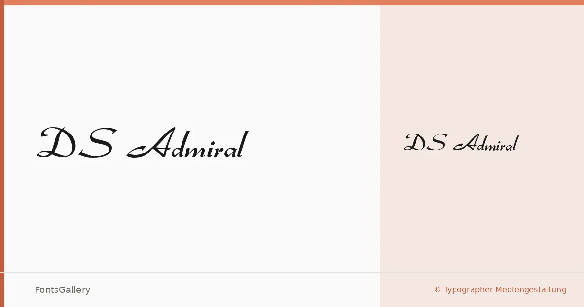
About DS Admiral Font
There is a deliberate formality to this script — the kind that belongs on a wax-sealed envelope or a hand-lettered diploma. DS Admiral comes from Typographer Mediengestaltung, released under their Steffmann imprint, and it carries the unhurried confidence of classical penmanship translated into a digital Latin typeface. The letterforms lean into tradition without apology, with the sweeping connectives and considered flourishes of an earlier era of fine correspondence.
Design Aesthetics & Character Characteristics
The family ships as a single Regular cut in TTF format, so the design carries its full weight in that one style — and it does. The mood reads as classic and romantic, edging toward luxury in the way that well-drawn calligraphic scripts tend to when the proportions are right. It sits naturally in contexts where elegance is the first requirement, not an afterthought. At display sizes the stroke contrast and looped ascenders do the expressive work; set smaller, it retains legibility without collapsing.
Recommended Usage & Font Pairing
Wedding invitations, certificates, greeting cards, and formal logos are where this script earns its place — anywhere the design calls for warmth with a ceremonial edge. For contrast pairings, the clean geometry of Helvetica or the editorial calm of Canela both give it room to breathe, while Adobe Caslon Pro or ABC Arizona bring a complementary period sensibility. Asap works well as a highly readable workhorse companion for any supporting body text the layout requires.
License & Usage Terms
DS Admiral is available for commercial use under terms from Typographer Mediengestaltung, though the license notes specify private use — confirm the exact scope directly at steffmann.de before committing it to a client project. The font is cleared for installable embedding.