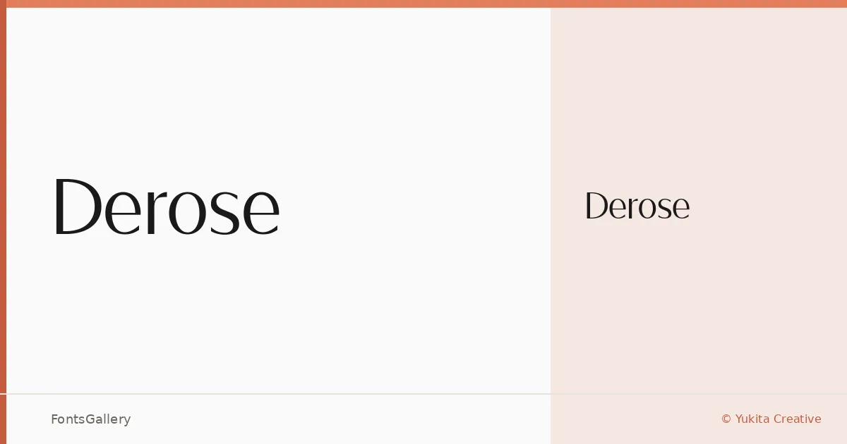
About Derose Font
There is a quiet confidence to the serifs here — refined stroke contrast, letterforms that carry weight without heaviness. Abdul Artega, working under Yukita Creative, released this face in 2022 as a single focused cut: Derose Medium. It is Latin-script only, delivered in both TTF and OTF formats.
Design Aesthetics & Character Characteristics
The design sits squarely in elegant, minimal serif territory — the kind of modern luxury that reads as considered rather than decorative. With only the Medium weight on offer, the family makes no attempt at a broad range; instead, it commits fully to one point on the scale where headlines and logotypes tend to live most comfortably. The letterforms feel composed and unhurried, with enough contrast in the strokes to read as luxury without tipping into ornamentation.
Recommended Usage & Font Pairing
Branding work, business cards, magazine headlines, and website headers are where this face earns its keep — anywhere a clean, upscale Latin-script serif sets the right tone without demanding attention. It pairs well alongside Etna, Armelie, Kactigona, and Bahnschrift for contrast in body copy or supporting elements, and sits naturally beside Helvetica when a straightforward typographic hierarchy is the goal.
License & Usage Terms
This family is offered under Personal Use terms, which means commercial use is not permitted — confirm licensing directly with Yukita Creative before applying it to any client or commercial job. Embedding is set to installable.