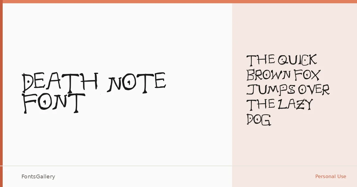
About Death Note Font
There is something immediately unsettling about these letterforms — an uneven, hand-captured quality that reads less like calligraphy and more like a note left in a hurry. Created by karlibell22 using fontcapture.com and carrying a 2009 copyright, the family preserves the raw imperfection of pen on paper, which is precisely where its character lives.
Design Aesthetics & Character Characteristics
This is a handwritten face with a grunge sensibility — strokes vary in weight, baselines drift just enough to feel organic rather than mechanical, and the overall mood sits somewhere between vintage journal and whimsical horror. The family ships as a single Medium weight in TTF format, so what you see is the whole set: one cut, committed to its own atmosphere. Partial Latin coverage keeps it suited to English-language work rather than multilingual projects.
Recommended Usage & Font Pairing
It earns its place on book covers, posters, and T-shirt designs where that handmade, slightly ominous texture is the point rather than an accident — branding with an edge, social media graphics that need to feel tactile and immediate. For contrast, the clean structure of Helvetica or the refined geometry of Canela gives it room to breathe, while Etna, ABC Arizona, or AQUA offer different registers of tension depending on how bold you want the overall composition to read.
License & Usage Terms
This family is distributed under Personal Use terms, which means it is not cleared for commercial work — confirm licensing directly with the rights holder before applying it to any paid project.