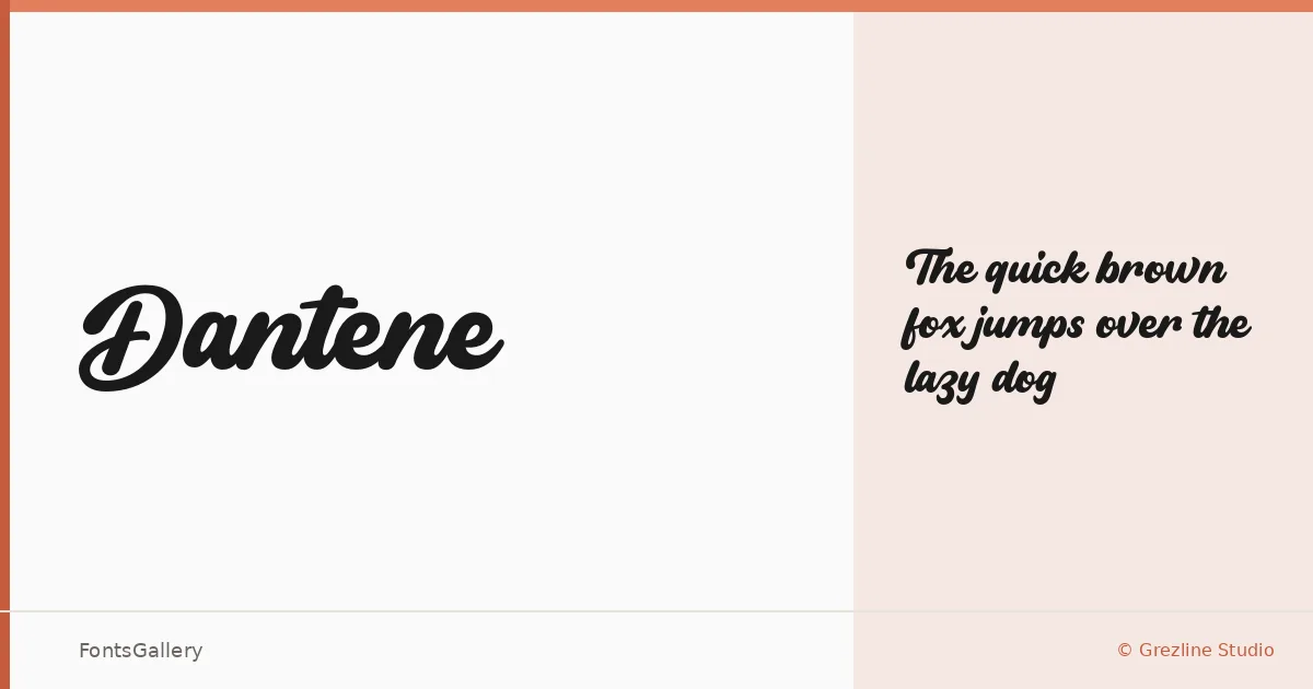
About Dantene Font
There is a studied elegance to the letterforms here — the kind of script that moves with intention rather than fuss. Designed by Akhmad Reza Fauzi of Grezline Studio, this is a single-weight OTF script built around a romantic, modern sensibility, with strokes that feel confident without tipping into excess.
Design Aesthetics & Character Characteristics
The Regular cut sits in that productive space between formal calligraphy and contemporary branding script — fluid enough to read as handcrafted, composed enough to hold its own at display sizes. Its Latin coverage keeps things focused, and the mood is consistently elegant and romantic without becoming overwrought. In practice, the letterforms carry well on dark backgrounds and hold their character even when set tightly on a business card or scaled large on a poster.
Recommended Usage & Font Pairing
It finds its footing in branding work, logo lockups, social media graphics, and poster headlines — anywhere a single strong script needs to anchor a layout without competing with itself. Pairing it with a clean geometric or humanist companion — Helvetica or Asap for editorial neutrality, Canela or Anglecia Pro for a warmer editorial tone, ABC Arizona when the brief calls for something more editorial and considered — tends to work well.
License & Usage Terms
This family is distributed under Personal Use terms, which means commercial use is not permitted — confirm licensing directly with Grezline Studio before committing it to a client job. Embedding is limited to preview and print only.