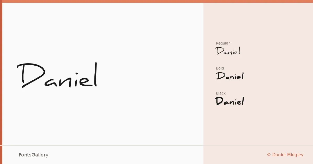
About Daniel Font
There is a looseness to this script that reads as genuinely hand-drawn rather than mechanically regularized — the kind of lettering you might find on a well-considered wedding envelope or a thoughtfully made greeting card. It was created by designer Daniel Midgley, and the family runs from a flowing Regular through a sturdy Bold to a weighty Black, giving the script real range in terms of visual pressure.
Design Aesthetics & Character Characteristics
Sitting squarely in the handwritten category, the family carries a mood that shifts depending on the weight: the Regular leans romantic and elegant, while the Black pushes into something more assertive and graphic without losing its playful character. All three cuts are available as OTF files and cover the Latin script. The forms have the kind of classic pen-influenced quality that holds up at display sizes, which is where this family does its best work.
Recommended Usage & Font Pairing
Invitation cards, greeting cards, branding materials, and logo treatments are natural territory here — anywhere the design calls for a human touch with enough structure to feel intentional rather than casual. Social media graphics benefit from the bolder weights, where the Black in particular commands attention at small scales. For contrast pairings, the clean geometry of Helvetica or the editorial refinement of Canela work well against the script's warmth, and Etna, ABC Arizona, or AQUA each offer their own counterpoint depending on the tone of the project.
License & Usage Terms
This family is released under the Creative Commons Attribution-NoDerivs License (CC BY-ND), which permits commercial use freely — modified copies may not be distributed, and attribution is appreciated where possible.