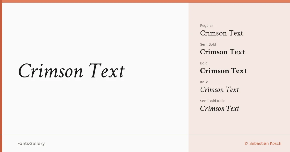
About Crimson Text Font
There is a quiet authority to this typeface — the kind that comes from studying the great Renaissance text faces rather than reacting against them. Sebastian Kosch designed it as a homage to the old-style types of the fifteenth and sixteenth centuries, and the influence shows in the tapered strokes, the low-contrast modulation, and the lively but measured rhythm that holds a paragraph together across long reading sessions.
Design Aesthetics & Character Characteristics
The family sits firmly in the classic, elegant register — professional without stiffness, vintage in its proportions but entirely at home on screen. Six cuts are included: Regular and Italic, SemiBold and SemiBold Italic, and Bold and Bold Italic, all delivered as TTFs. The SemiBold sits at a comfortable midpoint between text weight and emphasis, giving you real intermediate contrast rather than a blunt jump to Bold. The italics are genuinely calligraphic — not just sloped romans — which adds warmth and movement to display settings.
Recommended Usage & Font Pairing
The design earns its place wherever sustained reading matters: long-form editorial, book covers, magazine layouts, and website headers all benefit from its even color and classical proportions. Latin and Vietnamese are both supported, which extends its usefulness across multilingual publishing projects. As a text face it pairs naturally with clean sans-serifs like Helvetica or Asap; for more expressive combinations, the script faces Armelie and Kactigona introduce contrast without fighting the old-style structure, and Etna offers a sturdy alternative weight on the display end.
License & Usage Terms
Crimson Text is released under the SIL Open Font License, Version 1.1, which allows commercial use — embedding is permitted at the installable level, so you can distribute documents with the font included. Full license terms and FAQ are at https://scripts.sil.org/OFL.