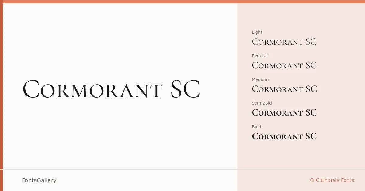
About Cormorant SC Font
There is a particular stillness to small-caps type when it is drawn with genuine care rather than mechanically scaled down — and that quality is exactly what Christian Thalmann of Catharsis Fonts has achieved here. This serif family is built entirely around the small-capitals form, giving every word an even, unhurried texture that sits beautifully in formal contexts. The letterforms carry the high contrast and fine-boned structure of a classical display roman, with delicate hairline strokes that reward careful printing and high-resolution rendering alike.
Design Aesthetics & Character Characteristics
The family runs from Light through Bold — five weights in all: Light, Regular, Medium, SemiBold, and Bold — delivered as TTFs. The mood throughout is classic and elegant, leaning toward the luxury and vintage end of the spectrum rather than anything neutral or workaday. Even at the lighter end the small-caps architecture holds its authority, and the heavier weights gain presence without losing the refinement that makes the design worth reaching for in the first place.
Recommended Usage & Font Pairing
Book covers, certificates, magazine headlines, and branding work are the natural territory here — any setting where classical gravitas earns its keep. Language coverage extends across Latin, partial Latin Extended, Vietnamese, and Cyrillic, which broadens its reach considerably for editorial and publishing projects. The clean geometry of Helvetica or Josefin Sans makes a sharp counterpoint to its formality, while Asap offers a more neutral workhorse pairing for body copy; for something warmer or more decorative, Armelie and Kactigona both complement its vintage sensibility well.
License & Usage Terms
Released under the SIL Open Font License, Version 1.1, commercial use is permitted and embedding is set to installable — full details at https://scripts.sil.org/OFL.