About Cormorant Font
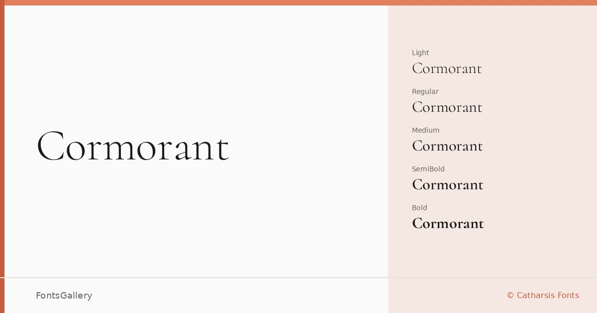
There is a refinement to the stroke contrast here that stops you in your tracks — hairlines that feel almost engraved, and serifs drawn with the kind of deliberate tension you associate with a skilled calligrapher rather than a type tool. Christian Thalmann of Catharsis Fonts built this display serif as a serious exercise in high-contrast Roman letterforms, and the result carries genuine conviction. The italics in particular have an expressive lean that complements the upright cuts without overpowering them.
Design Aesthetics & Character Characteristics
The family spans Light through Bold, with matching italics at every weight and variable fonts included alongside the static TTF files — so you have real flexibility in how tightly you control the weight axis. The overall character is classic and romantic, with a luxury register that sits closer to fine editorial than to corporate neutrality. Even the Medium and SemiBold weights hold onto that elegance; the contrast never collapses as the stems gain mass.
Recommended Usage & Font Pairing
The high contrast and refined mood make it a natural fit for book covers, magazine headlines, certificates, and logo wordmarks where a sense of occasion matters. Latin Extended (partial), Vietnamese, and Cyrillic support broaden its reach considerably for multilingual branding or publishing work. It pairs well with clean sans-serifs — Helvetica or Josefin Sans for cool geometric contrast, Asap for something more neutral, and Kactigona or Armelie when you want to stay in expressive, editorial territory.
License & Usage Terms
Released under the SIL Open Font License, Version 1.1, which allows commercial use freely; embedding is set to installable, so you can include it in documents and applications without restriction.