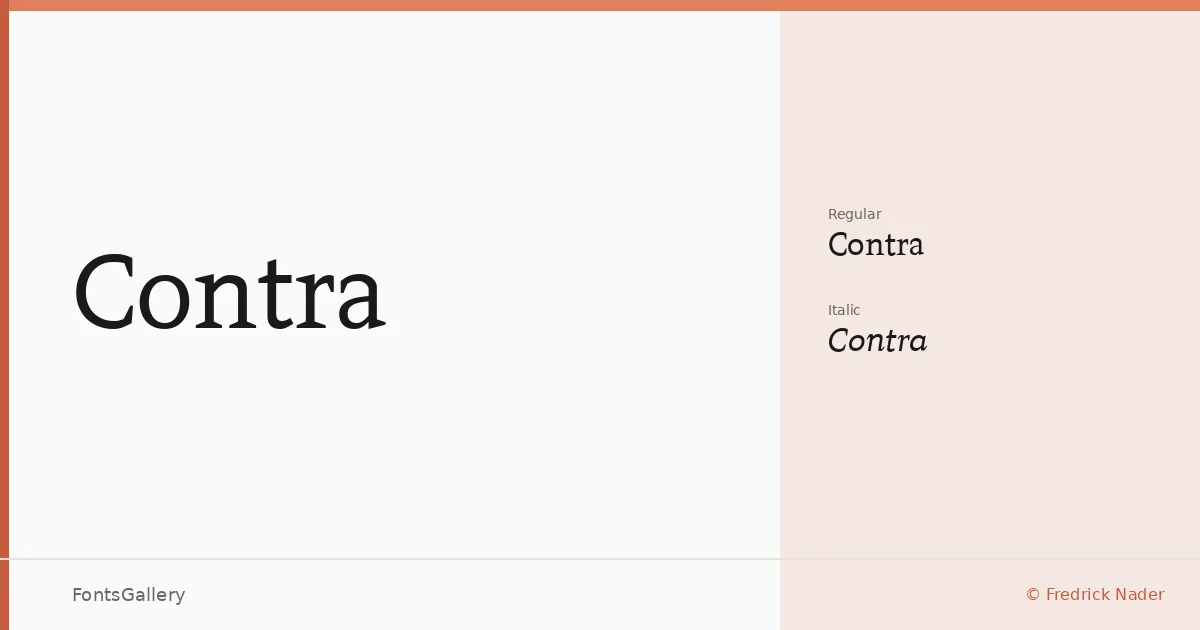
About Contra Font
There is a quiet authority in the way these serifs sit on the baseline — bracketed, confident, and built for text that needs to hold its ground. Fredrick Nader designed this slab serif family under the Apostrophic Lab banner, delivering two cuts: a Regular and a Regular Italic. The forms read as classical in their proportions while carrying a stripped-back, modern restraint that keeps them from feeling heavy-handed.
Design Aesthetics & Character Characteristics
The slab construction lends the family a professional solidity without rigidity — the kind of face that suits editorial work as much as identity design. Both the upright and italic are available as TTF files, covering Latin script with clean, minimal letterforms that hold up at headline sizes and still carry weight in display settings. The mood sits at the intersection of classic structure and contemporary economy, which is why the italic feels less like an afterthought and more like a genuine companion cut.
Recommended Usage & Font Pairing
Book covers, magazine headlines, and logo lockups are where this family does its clearest work — anywhere a branding context demands something that reads both serious and considered. It pairs well with the clean neutrality of Helvetica, or with contrasting script and display personalities like Armelie and Kactigona for editorial contrast; Etna and Asap offer additional options when you need a geometric or humanist companion in body copy.
License & Usage Terms
Contra is available for commercial use under its stated license, and the font files carry installable embedding permissions, meaning you can embed them in documents distributed to others.