About Cinzel Font
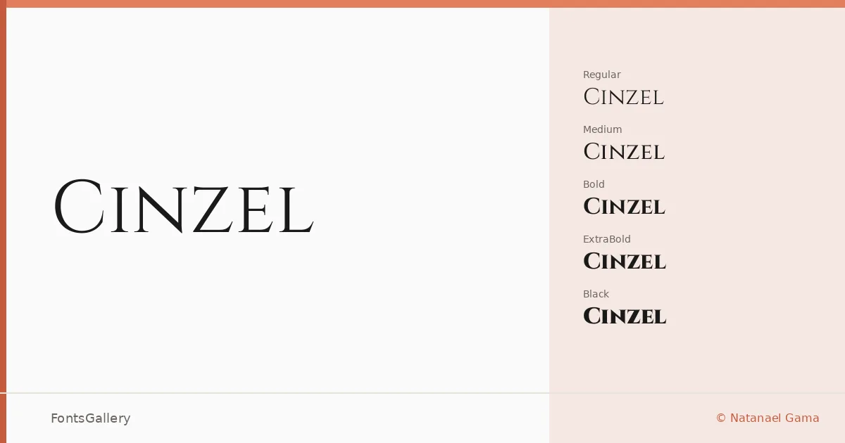
There is something lapidary about these capitals — the proportions echo ancient Roman inscriptions, but the execution is unmistakably contemporary. Natanael Gama drew this family with a clear debt to classical epigraphy, translating the geometry of chiseled stone letterforms into a typeface that carries genuine historical weight without feeling like a revival in the dusty sense. The result is a Latin-script serif with the kind of structural confidence that comes from knowing exactly what it is.
Design Aesthetics & Character Characteristics
The family spans six upright weights — Regular through Black — plus a Variable file that gives you the full range in a single TTF, making precise weight control straightforward wherever variable fonts are supported. Across all cuts, the forms are elegant and unapologetically bold in their architecture: high-contrast strokes, sharply bracketed serifs, and even spacing that reads as luxury without trying to shout. Lighter weights carry a ceremonial calm; the heavier cuts, ExtraBold and Black especially, command attention at display sizes.
Recommended Usage & Font Pairing
This is a headline and identity typeface first — book covers, logotypes, certificates, and brand marks are where it earns its keep, and the classic mood means it suits premium positioning naturally. For body text or supporting copy, pairing it with a neutral sans like Helvetica or Asap keeps things grounded, while a script like Armelie or the decorative warmth of Kactigona or Etna adds contrast for editorial or celebratory work. Coverage is Latin script.
License & Usage Terms
Cinzel is released under the SIL Open Font License, Version 1.1, which allows commercial use — full terms and the accompanying FAQ are at https://scripts.sil.org/OFL. Embedding is permitted at the installable level, so you can distribute documents and applications with the font included.