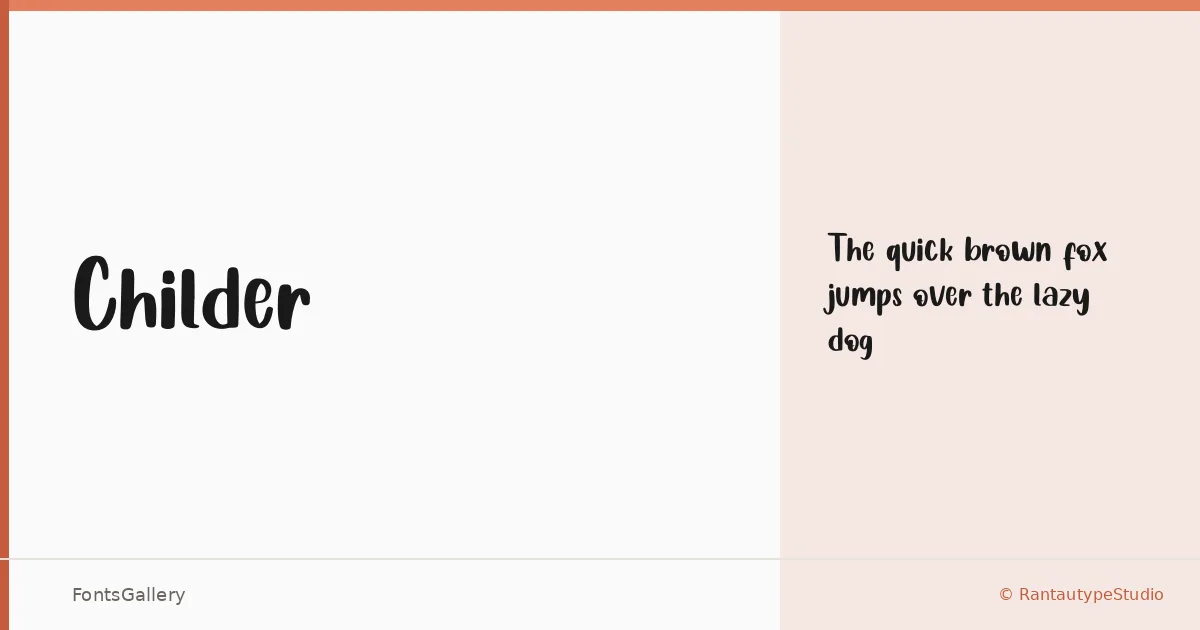
About Childer Font
There is a looseness to this script that reads immediately as hand-drawn — the kind of mark a skilled letterer leaves when they stop trying to be precise and just write. Childer comes from Yudi Pratama Chandra at RantautypeStudio, and it arrives as a single Regular weight in OTF format, which tells you something about its intent: this is a face built around a specific feeling, not a workhorse system.
Design Aesthetics & Character Characteristics
It sits squarely in the handwritten category, pulling together playful and whimsical energy with a rustic undercurrent — think slightly uneven baselines and strokes that carry the warmth of an actual hand rather than the polish of a digital brush. That combination gives Latin-script text an informal, approachable character that holds up well at display sizes. The single Regular cut means you use it for what it does best: expressive, headline-weight moments rather than body copy.
Recommended Usage & Font Pairing
The natural homes for this typeface are children's book covers and interiors, greeting card headlines, poster titles, and branding projects that need personality without aggression. It also translates well to social media graphics where a hand-crafted look cuts through the noise. For pairing, it sits comfortably alongside structured faces like Helvetica, Asap, or Canela, and holds its own next to more editorial choices such as ABC Arizona and Anglecia Pro — in each case, the contrast between the hand-drawn script and a cleaner companion is the whole point.
License & Usage Terms
Childer is released under a Personal Use license, which means commercial use is not permitted under standard terms — confirm licensing directly at rantaustudio.com/license/ before committing it to a client project.