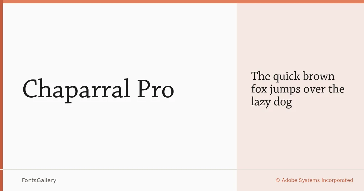
About Chaparral Pro Font
Carol Twombly's slab serif for Adobe Systems Incorporated carries a particular warmth that sets it apart from the colder, more mechanical members of the category. The serifs are bracketed with enough generosity to soften the structure, while the proportions lean toward the classical — wide, open, and unhurried. It arrived in the late 1990s and has aged without effort.
Design Aesthetics & Character Characteristics
The single available cut — Regular — is offered in OTF format and sits comfortably in the classic and elegant register, with a professional bearing that stops well short of stiffness. The letterforms carry a vintage quality rooted in humanist tradition: the axis tilts slightly, the strokes modulate with visible calligraphic memory, and the overall color on the page is even and inviting. It reads with confidence at headline scale and holds its character in longer text.
Recommended Usage & Font Pairing
Its unhurried elegance makes it a natural choice for book covers, magazine layouts, and website headers where the headline needs authority without aggression. Branding work that calls for a classical anchor will find the slab structure useful. It pairs well with clean sans-serifs — Helvetica, Aileron, and Abrade all work — or alongside display faces like Ballmain, Batoshi, and similar.
License & Usage Terms
This family is available under Personal Use terms; confirm clearance at http://www.adobe.com/type/legal.html before committing it to any commercial job. Embedding permissions are set to editable.