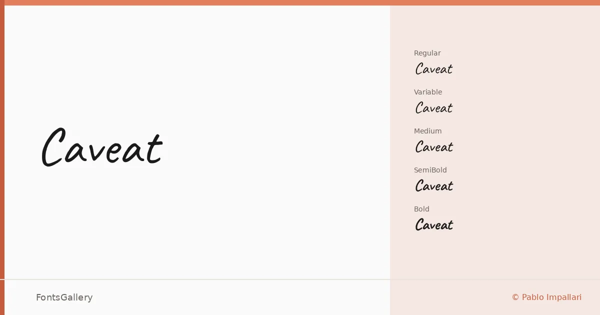
About Caveat Font
There is an ease to this script that most handwritten typefaces struggle to maintain — the letters lean into one another with the relaxed confidence of a pen moving without second-guessing itself. Pablo Impallari designed it, and the result carries that organic, slightly uneven quality that makes handwritten type feel genuinely personal rather than manufactured. Coverage extends across Latin, partial Latin Extended, and Cyrillic, giving it real reach for multilingual work.
Design Aesthetics & Character Characteristics
The family runs from Regular through Medium, SemiBold, and Bold, with a variable font also included — all delivered as TTF files. The mood sits somewhere between playful and romantic, with a whimsical looseness that never tips into chaos. Heavier weights like SemiBold and Bold hold their presence at display sizes without losing the handwritten warmth; the Regular stays light enough for delicate, intimate contexts. It is the kind of script that reads as personal even at a distance.
Recommended Usage & Font Pairing
The handwritten character makes it a natural fit for greeting cards, invitation design, and posters where a human touch matters — and it performs well in branding and social media graphics where personality needs to come through quickly. Among the listed pairings, it works with the editorial weight of Canela, the clean neutrality of Helvetica, and the structured character of Etna, as well as alongside AQUA and ABC Arizona for projects that want contrast between the spontaneous and the considered.
License & Usage Terms
Caveat is released under the SIL Open Font License, Version 1.1, which permits commercial use — details and the full FAQ are at http://scripts.sil.org/OFL. Embedding is installable, so you can bundle it within documents and applications without restriction.