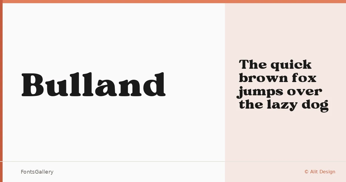
About Bulland Font
There is a deliberate heaviness to these slab serifs — bracketed, sturdy, the kind of letterforms that feel rooted to the page rather than floating on it. Designed by Ny Indrayana of Alit Design, Bulland arrives as a single Regular weight in TTF format, which is enough to read exactly what the designer intended: a face built around presence and restraint in equal measure.
Design Aesthetics & Character Characteristics
This is slab serif territory with a vintage, classic disposition — the sort of type that carries authority without shouting. The serifs are substantial, the overall color on the page is rich, and the proportions lean toward the broad and confident rather than the condensed and urgent. In use, it reads as professional and considered, with a warmth that keeps it from feeling cold or institutional.
Recommended Usage & Font Pairing
It belongs at large sizes: headlines, poster copy, magazine covers, logotypes, and branding marks where you need something that holds its shape and commands attention. For contrast in a layout, the clean geometry of Helvetica or Aileron works naturally against its weight, while the flowing curves of Allura or Ballmain provide a softer counterpoint. Abrade offers a contemporary edge that can sharpen the vintage quality without undermining it.
License & Usage Terms
Bulland is released under Personal Use terms — personal use only, so confirm licensing directly with Alit Design at www.alitdesign.net/license before committing it to any commercial job. Embedding is permitted as editable.