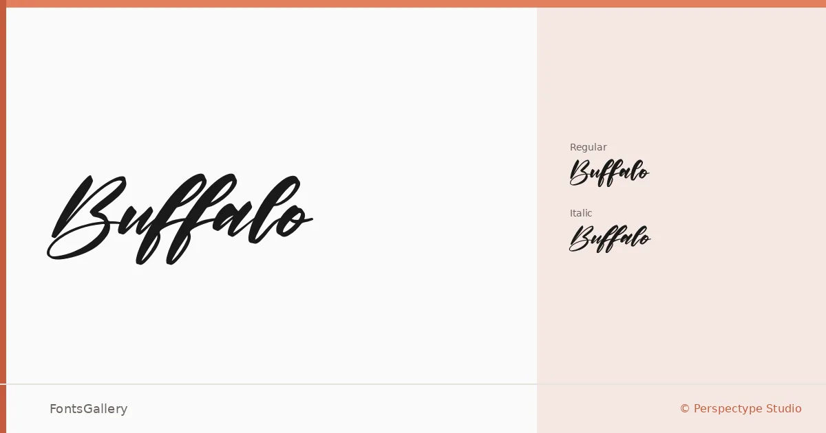
About Buffalo Font
There's a roughness baked into the strokes here — the kind of deliberate imperfection that reads as craft rather than carelessness. Perspectype Studio built this script with two cuts: a Regular and a Regular Italic, both delivered in TTF and OTF formats. The letterforms carry a bold, rustic weight that pulls from vintage signage and workwear graphics without feeling like a costume.
Design Aesthetics & Character Characteristics
This is a script with muscle. The mood sits at the intersection of modern confidence and vintage texture — thick strokes, expressive curves, and enough personality to anchor a composition on its own. The Regular holds the ground while the Italic introduces forward momentum and a slightly looser energy. Both cuts share that same worn, tactile quality that keeps them feeling handmade rather than mechanical. Latin character coverage covers the essentials for Western markets.
Recommended Usage & Font Pairing
The design lends itself to branding, logo work, poster headlines, T-shirt graphics, and social media visuals — anywhere a strong typographic voice needs to carry without supporting imagery. For contrast and balance, it pairs well with the cool geometry of Helvetica or the editorial warmth of Canela; ABC Arizona, Anglecia Pro, and (AH) Manal each offer their own counterpoint depending on how much refinement the project calls for.
License & Usage Terms
Buffalo is offered under Personal Use terms — ©Perspectype Studio 2021, All Rights Reserved — and does not permit commercial use; confirm licensing directly with the studio at [email protected] before applying it to any client or revenue-generating work.