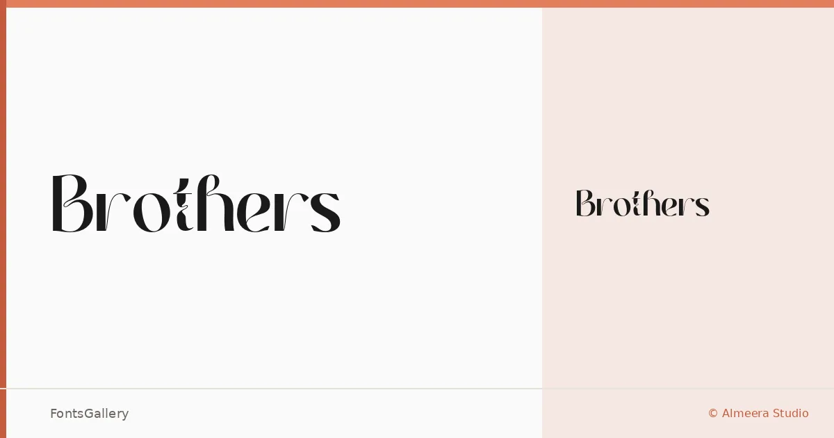
About Brothers Font
There is a particular authority to this serif — the kind that comes from letterforms that know exactly where they belong. Designed by Rinto Dwi Nugroho of Almeera Studio, Brothers arrives as a single Regular weight delivered in OTF format, built with a classical structure that leans confidently toward the contemporary.
Design Aesthetics & Character Characteristics
The mood sits at the intersection of classic elegance and modern luxury — serifs with enough presence to anchor a headline and enough refinement to carry a brand. In use, the forms feel composed and deliberate, suited to settings where every letter is meant to be noticed. Latin character coverage keeps the focus tight and the execution clean.
Recommended Usage & Font Pairing
It earns its place in branding systems, editorial headers, poster typography, logo lockups, and magazine display work where a serif needs to carry weight without feeling heavy. For pairing, the family works well alongside Etna, Armelie, Helvetica, Kactigona, and Bahnschrift — each offering a different kind of contrast, from neutral sans to expressive script.
License & Usage Terms
Brothers is available under Personal Use terms only — the full version with commercial use rights is offered separately, so confirm your licensing before taking it into a client project. Embedding is permitted at the editable level.