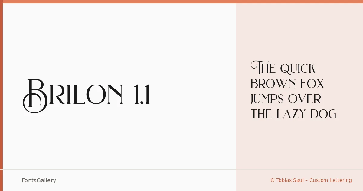
About Brilon 1.1 Font
There is a deliberate refinement to the serifs here — the kind of careful bracketing and contrast you associate with type drawn for prestige editorial work rather than utility. This is the work of Tobias Saul of Tobias Saul – Custom Lettering, and the single Regular cut speaks to a focused intention: get one weight exactly right. The letterforms carry a classical structure with a clarity that feels contemporary rather than archival.
Design Aesthetics & Character Characteristics
This is a serif that sits confidently at the intersection of classic elegance and modern luxury — the kind of voice that reads as authoritative in a headline and assured on a logo lockup. The family ships as a single Regular style in both TTF and OTF formats, which makes it a focused tool rather than a workhorse system. The contrast between thick and thin strokes is handled with restraint, giving it a polished presence without tipping into ornamentation.
Recommended Usage & Font Pairing
It earns its keep in branding, magazine headlines, wedding stationery, and logo work — anywhere that Latin-script copy needs to project a composed, upmarket tone. For text support or secondary setting, the listed pairing options span a useful range: Helvetica and Aileron bring neutral sans-serif balance, while Ballmain, Abrade, and Batoshi offer more character-driven contrast depending on the mood of the project.
License & Usage Terms
This family is released under Personal Use terms, which means commercial use is not covered — confirm licensing directly with the designer before committing it to a client job. Embedding is permitted at an editable level.