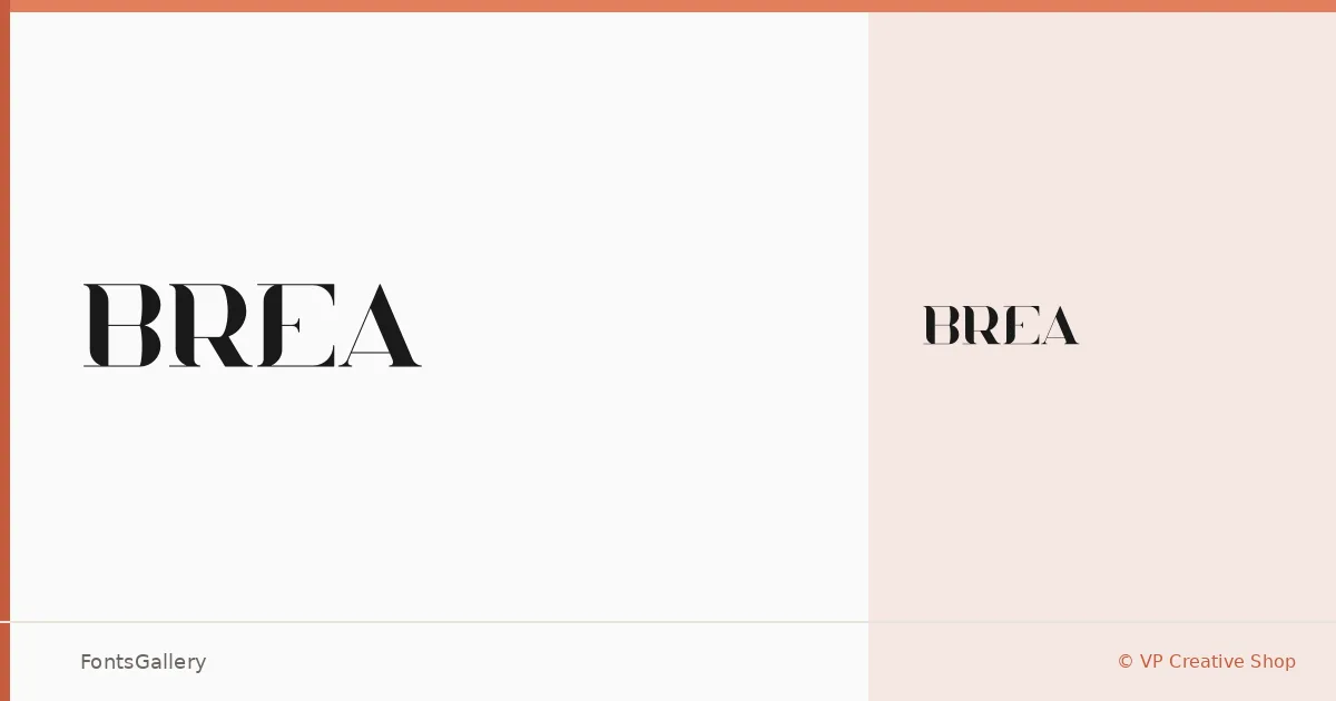
About Brea Font
There is a particular kind of serif that earns its keep through restraint — crisp terminals, confident stroke contrast, and just enough personality to feel considered rather than generic. Brea is that kind of face, designed by VP Creative Shop and delivered as a single Regular weight in OTF format. The letterforms sit somewhere between classical proportion and contemporary sharpness, which is what gives them their quiet authority.
Design Aesthetics & Character Characteristics
The mood here is classic and elegant, leaning toward luxury without becoming ornamental. With only a Regular cut available, this is a family built around one well-resolved idea rather than a range of weights to mix and match. Latin script is supported partially, so it handles core Western European copy comfortably. In use, the forms feel deliberate — the kind of serif you set large and let breathe.
Recommended Usage & Font Pairing
It earns its place most naturally in branding systems, on business cards, as a logo wordmark, or scaled up as a magazine or website header where the contrast in the strokes can do their work. For pairing, the designers suggest reaching for Etna, Angeletta, or Armelie when you want to stay in expressive territory, while Helvetica or Bahnschrift provide a clean sans-serif counterbalance when the layout calls for something more structured alongside it.
License & Usage Terms
Brea is released under Personal Use terms, which means commercial use is not permitted — confirm your rights with the designer before taking it into a client project. The font is licensed for installable embedding.