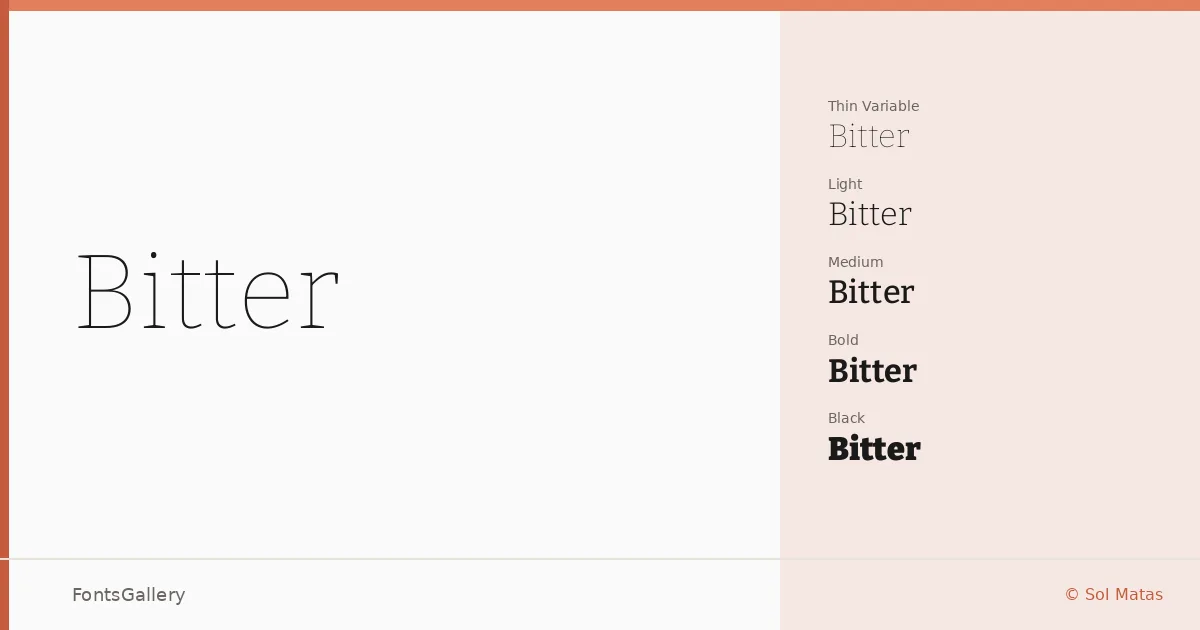
About Bitter Font
The serifs here have real weight to them — flat, bracketed slabs that hold their ground at any size, whether you're setting a headline or running body copy across a long scroll. Designed by Sol Matas and the Bitter project authors, the family was built with screen reading in mind, which gives the letterforms a sturdy clarity that print designers tend to appreciate just as much. The counters are open, the spacing generous, and the ink traps at the joins keep things crisp even at smaller sizes.
Design Aesthetics & Character Characteristics
This is a slab serif that sits confidently between classic and modern: structured enough to feel professional, but with enough contrast in the strokes to avoid feeling mechanical. The full range runs from Thin and ExtraLight through Regular, Medium, SemiBold, Bold, ExtraBold, and all the way to Black, with italic cuts at every weight, plus a variable font spanning the entire axis — giving you fine-grained control over weight in a single file delivered in TTF format. The italics are genuinely distinct rather than merely slanted, which matters when you're mixing weights across a layout. Language coverage extends across Latin, Latin Extended (partial), Vietnamese, and Cyrillic, making it a practical choice for multilingual editorial work.
Recommended Usage & Font Pairing
The weight range and screen-optimized construction make it especially well-suited to website headers, magazine layouts, and book cover titling, while the bolder cuts carry branding work without strain. For pairing, the designers have noted strong combinations with Etna, Armelie, Helvetica, Kactigona, and Bahnschrift — the latter two in particular offering clean, low-contrast counterpoints to the slab structure in body or supporting text roles.
License & Usage Terms
Released under the SIL Open Font License (OFL), Version 1.1, commercial use is permitted and embedding is set to installable — full license terms are available at https://openfontlicense.org.