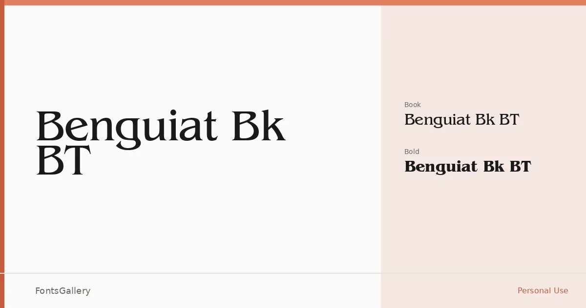
About Benguiat Bk BT Font
There is a particular weight to these serifs — bracketed, unhurried, drawn from an era when editorial typography was expected to carry authority on the page. The letterforms lean into a classical tradition without apology, and the Book weight carries that quality with genuine restraint. Copyright dates this cut to Bitstream's early-1990s library, placing it squarely in a period of careful digital refinement of pre-existing designs.
Design Aesthetics & Character Characteristics
This is a serif family with a luxury disposition — the kind of type that reads as considered rather than neutral. The two cuts available, Regular Book and Bold, give you a working range from composed body settings to assertive display use. The forms feel vintage in the best sense: high contrast, deliberate stroke modulation, and a structural elegance that suits headlines more than it does footnotes. Both styles are delivered as TTF files with Latin coverage.
Recommended Usage & Font Pairing
The natural territory here is anywhere the tone needs to feel curated and classical — book cover design, magazine headlines, logo lockups, and branding work that wants gravitas over novelty. For contrast pairings, the geometric clarity of Bahnschrift or Helvetica offsets the serif warmth well, while Angeletta, Etna, and Rasley Heights offer more decorative alternatives when the job calls for a layered, editorial feel.
License & Usage Terms
This family is available under Personal Use terms, which means commercial use is not permitted — confirm licensing before taking it into a client or revenue-generating project. Embedding is restricted under the current terms.