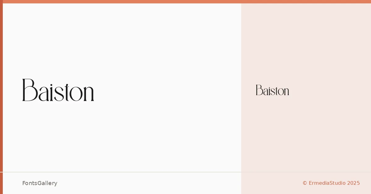
About Baiston Font
There is a quiet confidence to these serifs — nothing overworked, nothing superfluous. ErmediaStudio 2025 built the family in FontLab 8, and that craft-forward origin shows in the clean construction of each letterform. The single Regular weight arrives in OTF format, which keeps deployment straightforward.
Design Aesthetics & Character Characteristics
This is a serif that sits squarely in the elegant and minimal end of the spectrum, leaning into luxury without theatrical display. The forms feel modern in their proportions — restrained contrast, composed spacing — giving the Regular cut a composure that holds up whether it is set large on a poster or tight inside a logo lockup. With only the one style in the family, the design has to earn its keep through its inherent character, and it does.
Recommended Usage & Font Pairing
Its natural habitat is anywhere the work calls for refinement with a contemporary edge: branding systems, magazine headlines, website headers, and poster titles where a single well-chosen serif can carry the page. For pairing, the clean geometry of Bahnschrift or Helvetica will balance it as a body or UI companion, while Angeletta, Etna, and Rasley Heights can work alongside it when a more expressive secondary voice is needed in a layout.
License & Usage Terms
Baiston is released under a Personal Use license — commercial use is not permitted, so confirm licensing with ErmediaStudio 2025 before taking it into any client or revenue-generating work. Embedding is set to installable.