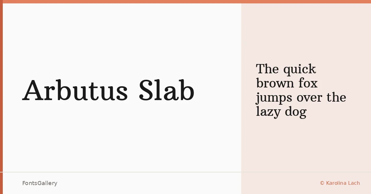
About Arbutus Slab Font
There is something immediately grounded about this face — the serifs carry weight without shouting, and the medium contrast between thick and thin strokes gives the letterforms a settled, confident presence. Designer Karolina Lach drew inspiration from 18th and 19th century American jobbing type, and that heritage shows in every capital and curve. The result is a single-weight slab serif with enough structural character to hold its own at display sizes and enough generosity in its spacing to stay readable when set smaller.
Design Aesthetics & Character Characteristics
Arbutus Slab sits comfortably in the classic and professional end of the slab serif spectrum, carrying a vintage warmth that feels earned rather than imposed. The family comes as a single Regular cut, available in TTF format, which keeps the decision simple — what you are working with is the typeface at its intended weight, neither lightened nor pushed toward heavy. The open spacing Lach built into the design is the quiet detail that makes it practical: text that might otherwise feel dense at body-adjacent sizes breathes instead.
Recommended Usage & Font Pairing
This is a face well suited to book covers, editorial headlines, magazine folios, branding work, and posters — anywhere a bold, classic voice needs to carry Latin-script text with authority. The vintage quality makes it especially convincing in contexts that want historical weight without resorting to pastiche. It pairs naturally with clean, structurally distinct faces; Helvetica makes a strong counterpart, and options like Ballmain, Alexandria, Batoshi, and Audex each offer complementary contrast depending on the tone of the project.
License & Usage Terms
Arbutus Slab is released under the SIL Open Font License, Version 1.1, which allows commercial use freely. Embedding is set to installable, so the font may be bundled within documents and applications without restriction under that license.