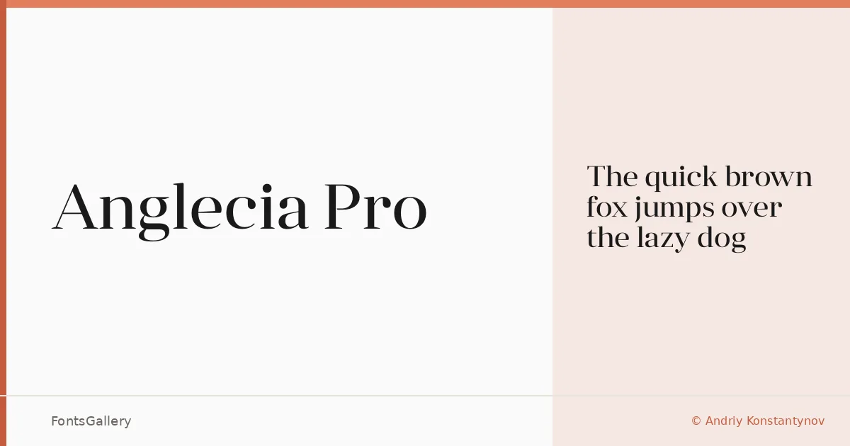
About Anglecia Pro Font
There is a certain deliberateness to the serifs here — crisp, high-contrast strokes that carry the weight of classic editorial tradition while staying sharp enough to feel contemporary. This display serif was designed by Andriy Konstantynov and is available as a single Display Regular cut in OTF format. The letterforms hold their composure at large sizes, which is exactly where they are meant to live.
Design Aesthetics & Character Characteristics
The family sits in a mood that reads as classic and elegant without retreating into the merely decorative — there is a luxury to the proportions, but also a modern restraint that keeps it from feeling heavy-handed. As a display-focused serif, the single Regular style is built for headlines and lockups rather than continuous text, and the forms reward generous tracking and careful leading. Latin (partial) and Cyrillic character coverage gives it meaningful reach across both scripts.
Recommended Usage & Font Pairing
The obvious territory is anywhere a headline needs to carry authority: book covers, magazine headers, branding systems, and logo work all suit it well. Website headers are a natural fit too, provided the size is kept large enough to let the contrast between thick and thin strokes do their work. For pairing, the clean geometry of Helvetica or Aileron makes a reliable counterpart to its seriffed formality, while Ballmain, Abrade, and Batoshi each offer more distinctive alternatives depending on the character you are after.
License & Usage Terms
Anglecia Pro is offered under Personal Use terms, which means commercial use is not permitted — confirm licensing directly with the designer before committing it to any paid work. Embedding is limited to preview and print only.