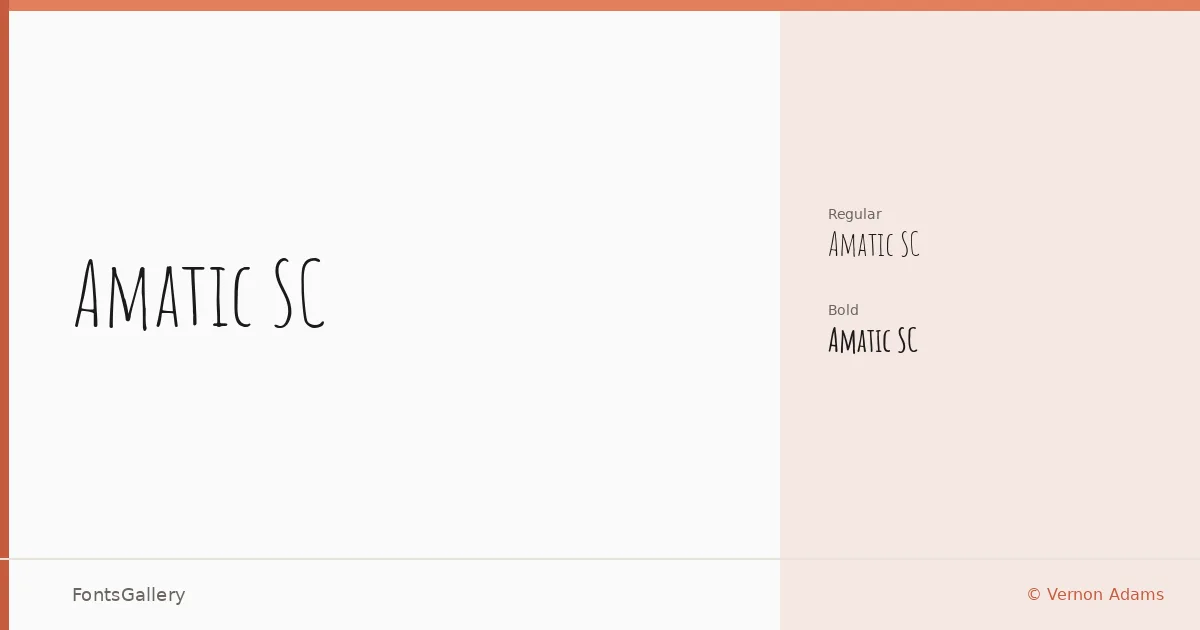
About Amatic SC Font
There is something immediately recognizable about the hand-drawn tension in these letters — each stroke feels considered but loose, as if written carefully on a chalkboard rather than set by machine. Developed by Vernon Adams and the Amatic SC project authors, this condensed all-caps handwritten face carries a warmth that geometric or calligraphic scripts rarely manage. The small-caps structure keeps it disciplined enough for headlines while the irregular ink weight keeps it human.
Design Aesthetics & Character Characteristics
The family sits in handwritten territory with a mood that moves between playful and rustic — whimsical without being juvenile, modern without feeling cold. Two weights are available: Regular and Bold, both delivered as TTF files. The Bold introduces enough contrast against the Regular to give you a working typographic hierarchy within the single family. Letterforms are narrow and upright, which makes them stack efficiently in poster-scale settings and hold together at header sizes on screen.
Recommended Usage & Font Pairing
The hand-drawn character makes it a natural fit for branding, logo work, poster headlines, and t-shirt design — any context where a touch of craft or personality needs to come through quickly. Language support spans Latin, partial Latin Extended, Vietnamese, Cyrillic, and Hebrew, making it workable across a wider range of projects than most handwritten faces. It pairs well with the clean neutrality of Helvetica or the editorial weight of Canela, and has been paired alongside AQUA, Etna, and ABC Arizona for contrast-driven compositions.
License & Usage Terms
Released under the SIL Open Font License, Version 1.1, which allows commercial use — full terms and FAQ are available at http://scripts.sil.org/OFL. The font is embedded with installable permissions, so it can be bundled in documents and applications without restriction under that license.