About Alfa Slab One Font
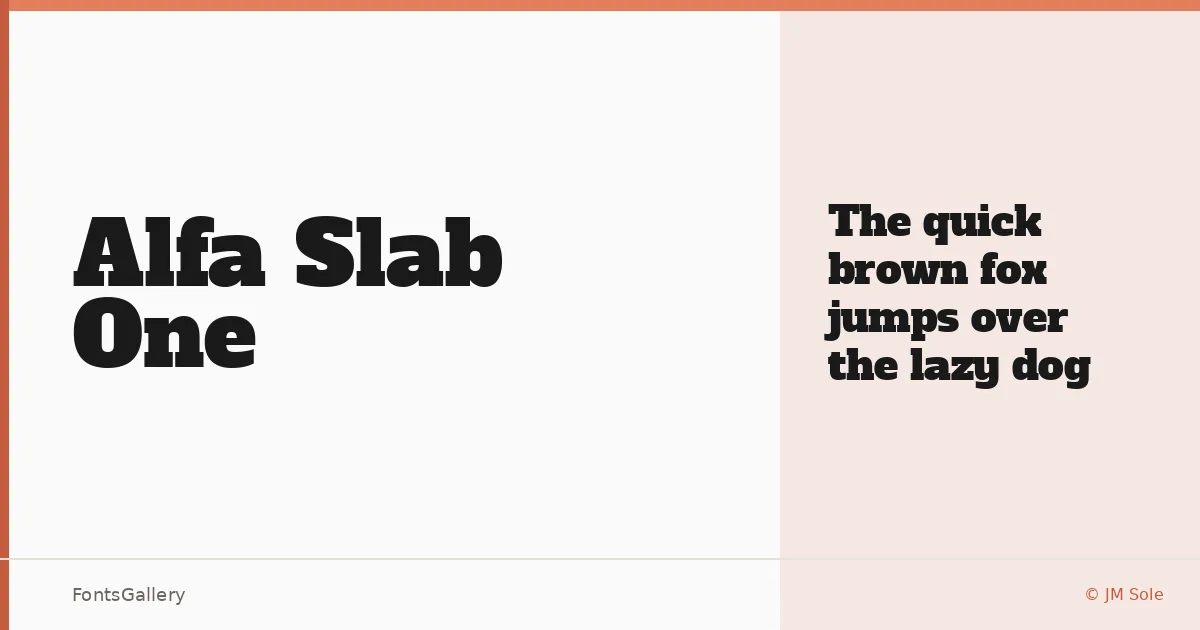
There is a commanding weight to this slab serif that announces itself the moment it lands on a page. Designed by JM Sole, it arrives as a single Regular cut — a deliberate, unhurried choice that puts everything into one unapologetic display weight. The serifs are thick and squared, the strokes heavy with a confidence that sits somewhere between a vintage broadside poster and a contemporary editorial splash.
Design Aesthetics & Character Characteristics
This is a slab serif built for impact, carrying a bold, classic character with just enough vintage warmth to feel considered rather than blunt. The single Regular style is no limitation here — the letterforms are drawn at a mass that already reads as a headline weight, dense and professional without tipping into aggression. Available in TTF format, it carries the kind of presence that smaller type sizes would simply waste.
Recommended Usage & Font Pairing
The obvious territory is anywhere size and authority matter: posters, magazine covers, advertisement headlines, and logo lockups that need Latin-script gravitas. Its vintage character also makes it a reliable opener for editorial layouts where the headline needs to carry the whole page. JM Sole pairs it well alongside Helvetica, Ballmain, Alexandria, Batoshi, and Audex — each offering a contrast in weight or structure that lets this slab lead without crowding the supporting text.
License & Usage Terms
Released under the SIL Open Font License, Version 1.1, which explicitly allows commercial use — full details and the accompanying FAQ are at http://scripts.sil.org/OFL. Embedding is permitted at the installable level, so the file travels cleanly inside documents and applications.