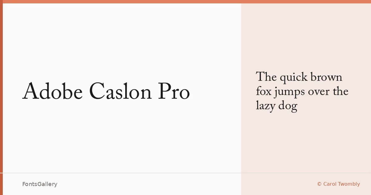
About Adobe Caslon Pro Font
Carol Twombly's revival of William Caslon's eighteenth-century types remains one of the most carefully considered interpretations of that material in digital form. The Roman and italic carry the slight irregularity and warmth of the original punch-cut letters without feeling archaic — there is life in the serifs and a natural variation in stroke weight that mechanical faces rarely achieve. The family is available in OTF format and covers the Latin script.
Design Aesthetics & Character Characteristics
This is a classic serif with an elegance that reads as professional rather than decorative, and a vintage quality that comes from the source material rather than from affectation. The single Regular cut presented here shows off the balance Twombly struck between historical fidelity and contemporary legibility — open counters, bracketed serifs, and a moderate x-height that holds up at both text and display sizes. The letterforms have enough character to read as considered on a book cover or certificate without demanding attention away from the words themselves.
Recommended Usage & Font Pairing
Its classic and professional mood makes it well suited to book covers, magazine editorial, certificates, branding, and business cards — anywhere the authority of a well-made serif matters. For contrast pairings, the clean geometry of Helvetica or Josefin Sans sits naturally against it, while Asap offers a more neutral companion; Armelie and Kactigona can introduce a softer or more distinctive register depending on the job.
License & Usage Terms
This family is distributed under Personal Use terms — confirm clearance at http://www.adobe.com/type/legal.html before applying it to any commercial job. Embedding is permitted for preview and print only.