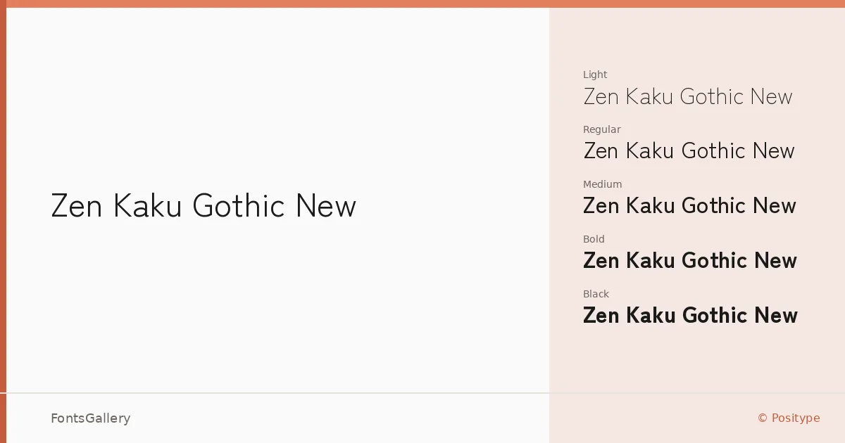
About Zen Kaku Gothic New Font
There is a particular evenness to this gothic — the strokes sit with quiet authority, neither cold nor decorative, holding Japanese and Latin letterforms to the same measured geometric logic. Designed by Yoshimichi Ohira and released through Positype, the family covers a genuinely broad script range: Latin, Cyrillic, Han, Hiragana, and Katakana all share the same considered construction, which is rarer than it sounds.
Design Aesthetics & Character Characteristics
This is a sans serif built around restraint — minimal in its details, modern in its proportions, and professional in the way it holds its shape under pressure. The family runs from Light through Regular, Medium, Bold, and Black, giving you a full range of tonal contrast within a single consistent voice. Each weight feels purposefully spaced, so the progression from text setting to display use stays coherent rather than disjointed. Files ship as TTF, suitable for both desktop and web workflows.
Recommended Usage & Font Pairing
The clean geometry makes it a natural choice for branding systems, website headers, signage, and editorial layouts where the type needs to carry structural weight without competing with imagery. Its multilingual reach — covering Han, Hiragana, and Katakana alongside Latin and Cyrillic — makes it genuinely useful for international publishing and presentation work that cannot afford to switch typefaces mid-document. For pairing, the neutrality of the gothic works well against the warmth of Canela or Magnolia Script, and the contrast with a pointed serif like Times New Roman is a reliable editorial move; Angeletta brings a more calligraphic counterpoint, while Minecraft leans into a harder-edged, screen-native aesthetic.
License & Usage Terms
Released under the SIL Open Font License (OFL), Version 1.1, with full commercial use permitted and installable embedding rights — details at https://scripts.sil.org/OFL.