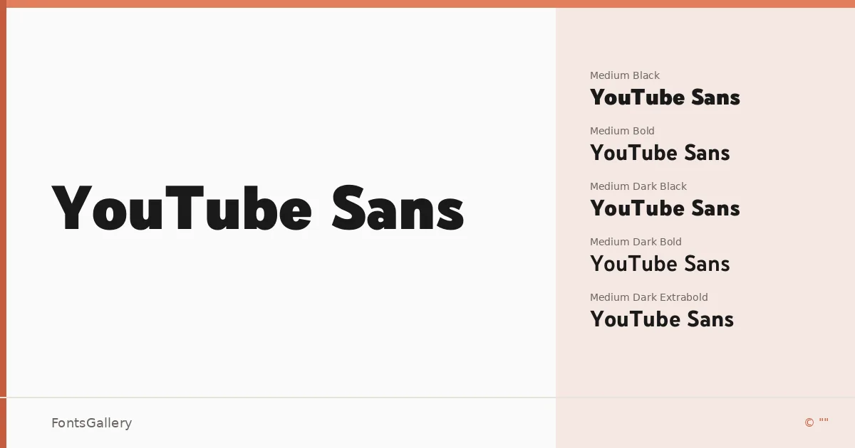
About YouTube Sans Font
There is a controlled confidence to this sans-serif — the kind that comes from letterforms designed to work at scale, across screens, and at speed. Carrying a 2019 copyright from Google LLC, it was built with platform identity in mind, and that intent shows in every curve and terminal. The strokes are clean without being cold, geometric without losing warmth at smaller sizes.
Design Aesthetics & Character Characteristics
The family spans fourteen styles across two themes — a standard set and a Dark variant — running from Light through Black, with Regular, Medium, Semibold, Bold, Extrabold, and Black cuts available in both. All files are delivered in OTF format. The overall mood sits firmly in modern and professional territory: minimal in its construction, bold in its presence. The Dark styles are not simply weight adjustments — they carry distinct optical tuning that makes them read clearly against dark backgrounds, which is exactly the kind of practical thinking that separates a purpose-built family from a generic one.
Recommended Usage & Font Pairing
The weight range and sharp legibility make this family well-suited to headline work, website headers, branding systems, and social media graphics where hierarchy needs to be established quickly. Signage at large sizes is where the heavier cuts genuinely earn their keep. Latin and partial Latin Extended coverage handles most Western European copy. For pairing, the family works alongside AQUA, Ballmain, 321 Impact, Aranea, and Batoshi — each offering a different contrast in texture or structure depending on what the layout needs.
License & Usage Terms
This family is offered under Personal Use terms — commercial use is not permitted, so confirm your rights carefully before using it in any client or revenue-generating work. Embedding is set to installable.