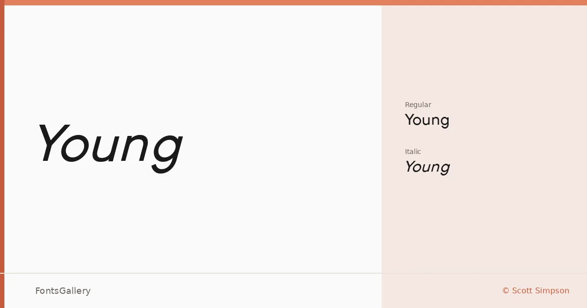
About Young Font
There is a certain economy to this sans serif — clean strokes, minimal fuss, the kind of restraint that reads as confidence rather than timidity. It was designed by Scott Simpson, and the copyright dates to 2011. What holds your attention is how the letterforms stay open and approachable while maintaining a sharp, modern edge that rarely tips into coldness.
Design Aesthetics & Character Characteristics
The family sits squarely in the sans serif category, leaning into an elegant, professional mood without sacrificing a sense of lightness. It ships in two cuts — Regular and Regular Italic — delivered as TTF files, which keeps the footprint small and the implementation straightforward. The italic carries just enough angle to signal distinction without breaking the overall calm of the system.
Recommended Usage & Font Pairing
The minimal character makes it well suited to branding, logo work, website headers, and editorial layouts where hierarchy needs to land quickly — a magazine spread or a social media header, for instance, where first impressions carry weight. It pairs thoughtfully with Canela for a contemporary editorial contrast, with Angeletta or Magnolia Script when you want something warmer underneath it, and with Times New Roman or Minecraft when the job calls for a more deliberate stylistic tension.
License & Usage Terms
Young is available for commercial use under Scott Simpson's terms. Embedding is permitted for preview and print only, so factor that in if your workflow involves interactive or editable PDF distribution.