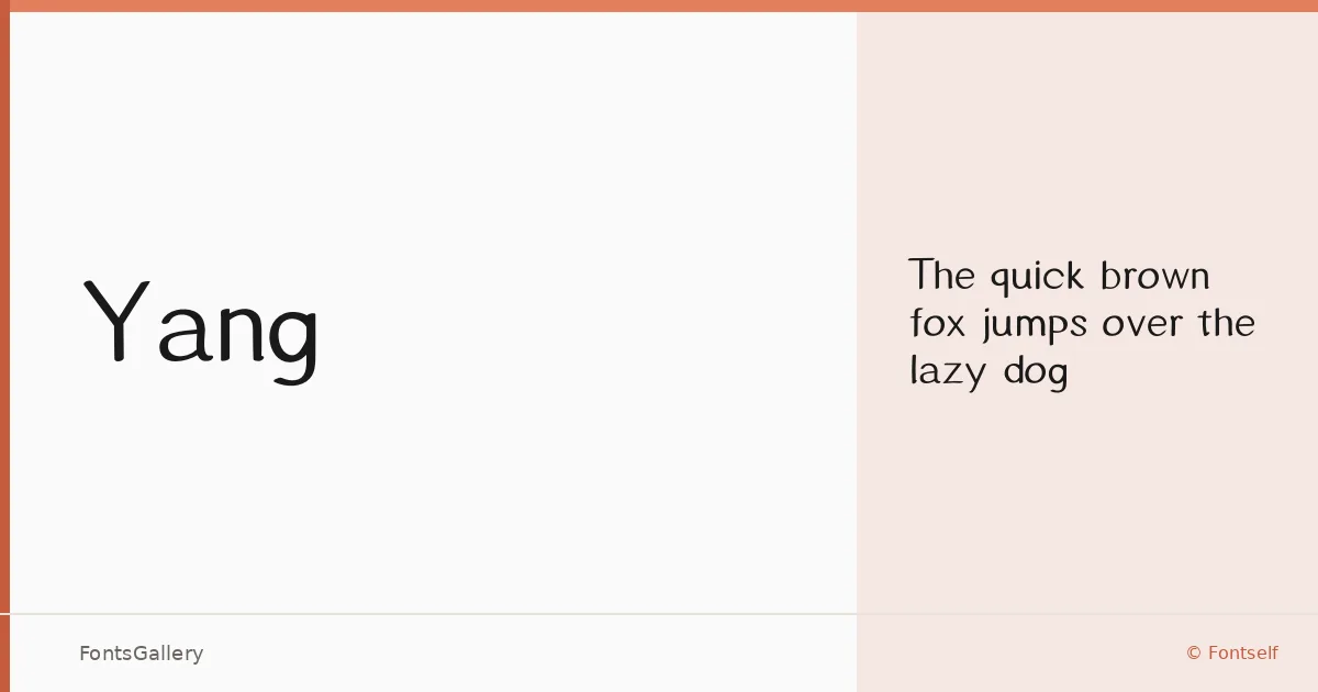
About Yang Font
There is a quietness to this sans serif that earns attention without demanding it. Designed by Haoyang Guan under the Fontself foundry, the single Regular weight carries a restraint in its letterforms — clean terminals, measured spacing, and a structural calm that reads as intentional rather than plain.
Design Aesthetics & Character Characteristics
The family sits firmly in the minimal and modern register, with an elegance that leans professional without feeling corporate. Available as a single Regular cut in OTF format, it works through precision rather than weight contrast — the kind of face where every curve feels considered. Partial Latin coverage means it handles the core character set confidently, though extended multilingual work will need checking against your specific requirements.
Recommended Usage & Font Pairing
Its natural territory is anywhere a brand needs to speak with clarity and composure: logo lockups, business cards, magazine headers, and website navigation all sit comfortably within its range. For pairing, the contrast-rich serif texture of Canela or ABC Arizona gives it a strong editorial foil, while Armelie and Kactigona offer more expressive companions for display-led work. Minecraft lands at the opposite end of the mood spectrum and can create a deliberate tension if that is the brief.
License & Usage Terms
Yang is available for commercial use under its current terms, with installable embedding permitted — however, the designer asks that you contact them directly before applying it to a commercial project.