About Work Sans Font
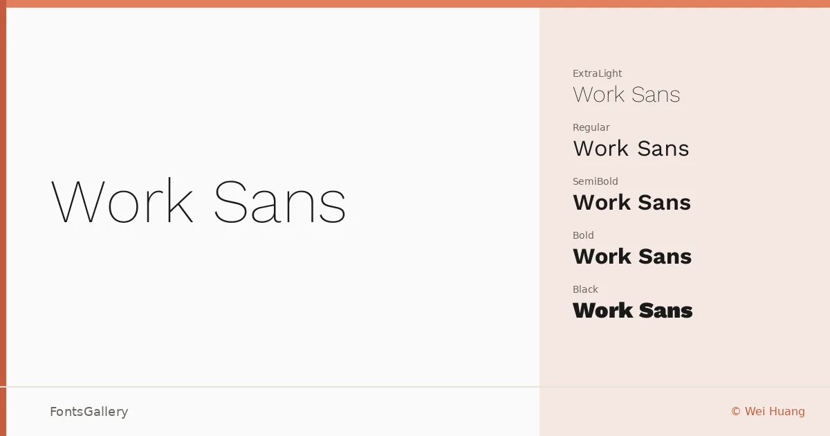
There is a particular evenness to this grotesque — letters that sit quietly on the baseline, spacing that never calls attention to itself, and a structural clarity that holds up whether you are setting a single word large or running a paragraph small. It comes from designer Wei Huang, and the family spans Thin through Black, each weight accompanied by a matching italic, plus variable font files that give you the full range in a single TTF.
Design Aesthetics & Character Characteristics
The family belongs squarely in the modern sans serif tradition, with a minimal, professional character that avoids both the rigidity of older gothics and the self-conscious geometry of newer display faces. Thin and ExtraLight feel airy and editorial; Medium and SemiBold carry authority without heaviness; ExtraBold and Black hit hard enough for headlines without losing the family's inherent composure. The italic cuts follow the upright construction closely, keeping the whole range coherent across a layout.
Recommended Usage & Font Pairing
The weight range makes it a natural choice for website headers, presentation decks, and branded business stationery, where you need a face that reads as considered rather than neutral. Magazine layouts benefit from the contrast between Thin display lines and Medium body settings. Latin Extended and Vietnamese support extends the family's usefulness across multilingual projects. It pairs well with the editorial warmth of Canela, the script personality of Armelie or Kactigona, and the impact-driven display weight of 321 Impact or AQUA.
License & Usage Terms
Work Sans is released under the SIL Open Font License, Version 1.1, which permits commercial use and installable embedding — full terms are available at http://scripts.sil.org/OFL.