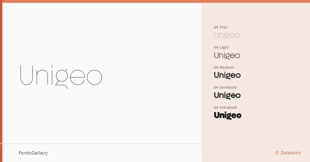
About Unigeo Font
There is a quiet precision to the letterforms here — strokes that commit fully to geometric construction without losing the warmth that makes a sans serif actually readable. Cosimo Lorenzo Pancini and Francesco Canovaro of Zetafonts designed this family, and the range they've built reflects a serious interest in systematic design: two subfamilies (Unigeo64 and Unigeo128) spanning Thin through ExtraBold, each with matching italics across the full weight range in the 64 series, delivered in TTF format.
Design Aesthetics & Character Characteristics
The overall mood is minimal and professional, with the kind of controlled elegance that reads as modern without chasing trend. Across the Thin through ExtraBold weights, the forms stay consistent — open apertures, even stroke contrast, and a geometric skeleton that holds its character whether you're setting it large or small. The italics in the 64 series give the family genuine typographic range, letting weight shifts do expressive work without breaking the underlying system.
Recommended Usage & Font Pairing
The weight spread and clean geometry make this well-suited to branding, logo work, magazine layouts, and website headers — anywhere that demands a confident, legible sans that doesn't call attention to itself. Language coverage extends to Latin, Cyrillic, and Greek, which broadens its usefulness across multilingual editorial and identity projects. It pairs well with Canela, ABC Arizona, Armelie, Kactigona, and 321 Impact, giving you options whether you want contrast with a serif, a complementary script, or a display counterpart.
License & Usage Terms
This download is provided under a Demo license covering personal, non-commercial use only — individuals may use it freely for student work, pro-bono projects, and non-profit purposes, but commercial use requires purchasing a separate license from Zetafonts at www.zetafonts.com/licensing; the license does not extend to corporate or studio entities under these demo terms.