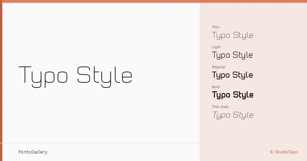
About Typo Style Font
There is a clean, deliberate tension in these letterforms — geometry pulled tight, with nothing left to chance. Mehmet Abacı of StudioTypo built this sans serif with a distinctly contemporary edge, keeping proportions spare and construction precise. The result sits comfortably in the futuristic and minimal end of the spectrum without tipping into cold abstraction.
Design Aesthetics & Character Characteristics
The family runs from Thin through Bold, each with a matching italic, giving you eight cuts in OTF format — Thin, Light, Regular, and Bold, all with corresponding italics. The thinner weights carry an almost architectural stillness, while Bold holds enough authority for punchy, large-scale work. Across the range, the forms feel modern and professional, built for settings where clarity and considered structure matter more than decoration.
Recommended Usage & Font Pairing
The design earns its place in branding, logo work, poster headlines, and website headers — anywhere Latin-script copy needs to project confidence at scale. For contrast-driven layouts, the family has been paired with AQUA, Ballmain, 321 Impact, Aranea, and Batoshi, each offering a different counterpoint in texture or weight.
License & Usage Terms
These files are released under a Demo license, which covers personal exploration only — StudioTypo requires a commercial license before any professional deployment, and embedding is restricted, so confirm terms at studiotypo.com/license before committing this to a client job.