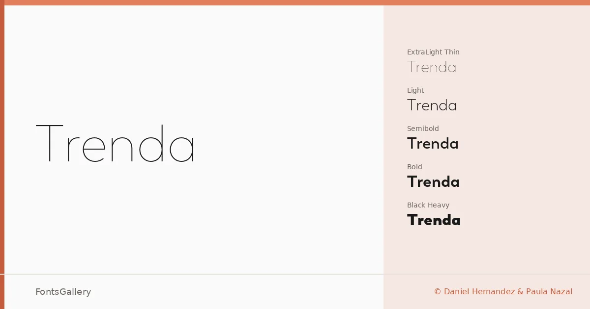
About Trenda Font
There is a clean, unhurried confidence to these letterforms — the kind that comes from designers who know exactly when to stop. Daniel Hernandez and Paula Nazal built this sans serif with geometry kept in check by just enough optical warmth, so nothing feels mechanical at close reading. The result is a family that holds its posture from the lightest weights all the way through to the heaviest.
Design Aesthetics & Character Characteristics
The family spans an impressive range: Thin and Thin Italic, Extra Light and Extra Light Italic, Light and Light Italic, Regular and Italic, Semibold and Semibold Italic, Bold and Bold Italic, Black and Black Italic, and Heavy and Heavy Italic — sixteen cuts in OTF format. The mood across all of them is minimal and professional, with the elegance sitting quietly in the proportions rather than in any decorative flourish. At display sizes the forms feel modern without strain; set smaller, they settle into a reliable neutrality that keeps editorial layouts breathing.
Recommended Usage & Font Pairing
This is a family built for work that needs to command a page: magazine headlines, website headers, brand identities, and logo lockups where weight contrast can do real work. The lighter cuts are well suited to airy editorial spreads, while Black and Heavy carry the load when a headline needs presence. It pairs with Canela for an editorial serif contrast, with Angeletta or Armelie when a calligraphic counterpoint suits the brief, and with Times New Roman when a more classical pairing is called for.
License & Usage Terms
These files are offered under a Demo license, which covers personal use only — confirm licensing terms with the foundry before taking the font into any commercial project. The files do carry editable embedding permission.