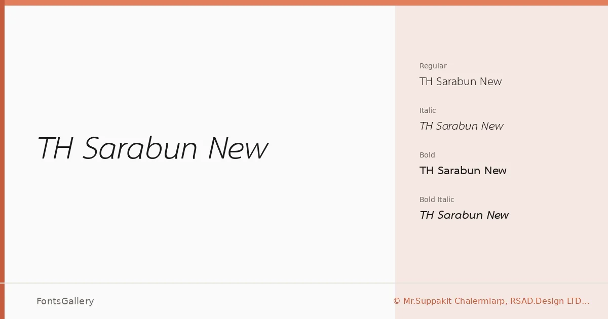
About TH Sarabun New Font
There is a quiet steadiness to these letterforms — clean stroke transitions, open counters, and a Thai script construction that sits comfortably alongside its Latin companions without either side feeling like an afterthought. The family was designed by Suppakit Chalermlarp under the RSAD.Design LTD. foundry, and the copyright originates with the Software Industry Promotion Agency (SIPA). That institutional backing shows: the drawing is disciplined, consistent, and built to hold up at small sizes as well as large ones.
Design Aesthetics & Character Characteristics
This is a sans serif that reads as simultaneously classic and modern — minimal in construction, professional in tone. The family ships as four TTF styles: Regular, Italic, Bold, and Bold Italic, a focused set that covers most editorial and corporate needs without unnecessary weight inflation. The stroke weight is restrained across all cuts, and the Italic maintains the same composed character rather than leaning into exaggerated calligraphic angles.
Recommended Usage & Font Pairing
The trilingual coverage — Latin, Vietnamese, and Thai — makes this particularly well-suited to publications, websites, and branding work that must function across Southeast Asian markets. It handles book covers and magazine layouts with the kind of neutral confidence that lets imagery and hierarchy do the work. For pairing, the structured geometry here plays well against the editorial warmth of Canela or Rasley Heights, while Dharma Gothic E introduces a strong display contrast; Times New Roman and Angeletta offer classical and script counterpoints respectively.
License & Usage Terms
TH Sarabun New is available for commercial use under the GNU General Public License (version 2 or later), which permits redistribution and modification; embedding is permitted at the installable level, and documents that embed unaltered portions of the font are not themselves subject to the GPL under the terms of the special font exception included in the license.